
Excel Dashboard Integrated with Google Analytics API (GA4)
Project Goal:
For over 10 years, we have been creating reports based on data from Google Analytics – for marketing departments, agencies, management, and investors. Through the years, we observed the same problem:
Google Analytics data is available, but rarely truly utilized.
Companies had access to detailed information on user behavior, but:
- exports were manual and time-consuming,
- the data had to be organized in Excel,
- many people in the company did not know how to use the GA interface,
- reports were either too general or too complex to support quick decisions.
That’s why we created a set of automated dashboards that retrieve data directly from the Google Analytics API and present it in a clear, practical way — ready for analysis and action.
What’s more, these dashboards were also used during due diligence processes and capital transactions.
This allowed us to verify actual website traffic, user engagement, quality of acquired traffic, and demographic segmentation – all to:
- assess the quality of the sales funnel,
- confirm figures declared by companies subject to investment,
- conduct independent analysis of marketing and retention effectiveness.
This approach enabled investors and funds to assess the online value and potential of the entities studied much more accurately – without having to rely solely on declarations or business presentations.
Scope of Work
- Integration with Google Analytics API
- Retrieving data on:
• number of sessions,
• visit duration,
• bounce rate,
• countries, cities, and devices
• Segmentation by: age, gender, location, device type, and weekday - Creation of an interactive dashboard in Excel using Power Pivot and Power Query
- Adding filters and conditional formatting to instantly identify patterns and anomalies
- Ability to connect with data from CRM, campaigns, or e-commerce
Effect
- One report instead of many sources – available in Excel, ready for filtering, export, or presentation.
- Reduced report preparation time from several hours to just seconds.
- Better marketing decisions thanks to visible trends and anomalies.
- Greater transparency for management and the ability to respond in real time.
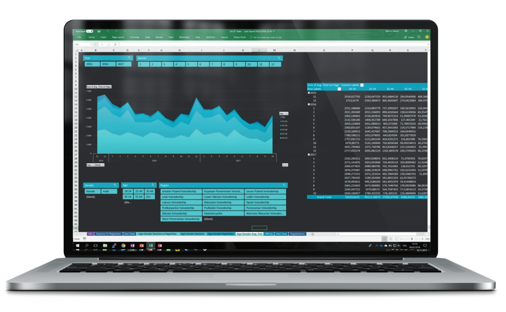
Time on Site Segmentation by Age, Gender, and Region
This view displays the average time spent on the website broken down by age groups and gender, with the ability to filter results by regions and months. The dashboard was built in Excel, using data pulled directly from the Google Analytics API.
- On the left – a stacked chart showing changes in average time on site month by month.
- On the right – a detailed pivot table presenting data by age group and month.
- At the bottom – filters allowing segmentation by gender, age, and geographic region.
With this analysis, users can easily:
- compare user engagement across different demographic groups,
- identify drops and rises in user attention over time,
- make content and UX decisions based on actual data.
User Location and Demographics – in a Single View
This dashboard combines geographic and demographic data from Google Analytics, presenting it in a clear and interactive format. The goal was to minimize the time required for manual report preparation and increase time spent on real data analysis.
- The top section of the report contains filterable data by age, gender, city, and region.
- On the left – a bar chart displays session numbers over time, broken down by age group.
- On the right – an interactive map with demographic data enables analysis of user activity in specific locations.
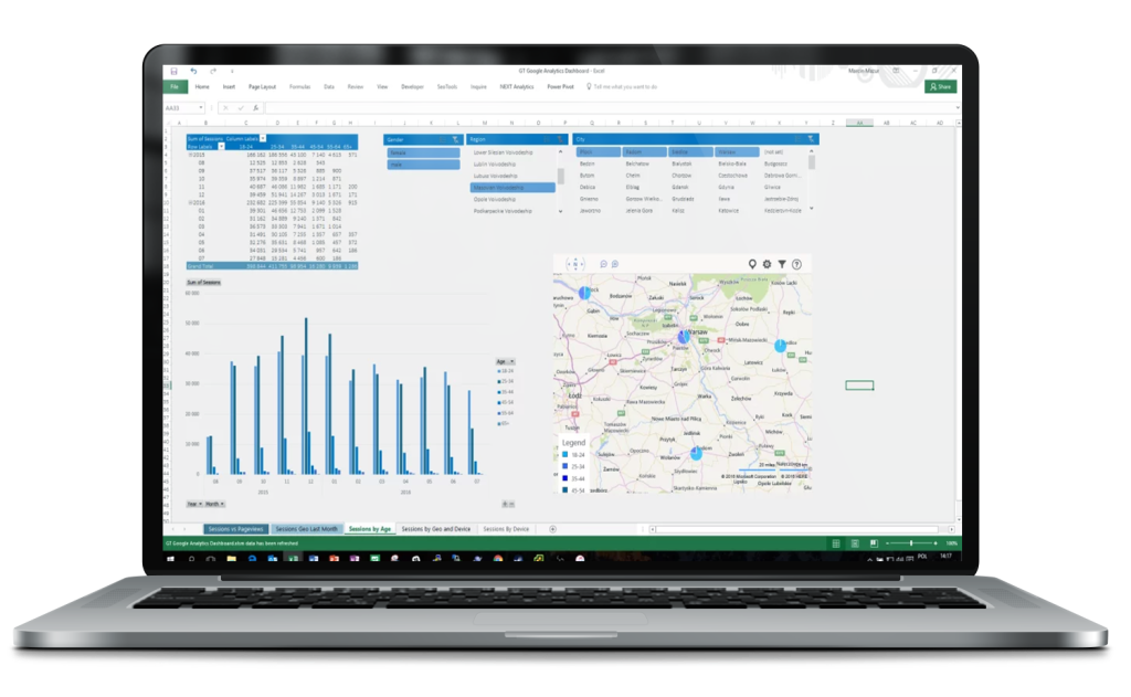
With this view:
- the marketing team can instantly identify where and who generates the most traffic,
- management receives ready-made material for decision-making without sifting through GA,
- the entire report updates automatically – no tedious spreadsheet work required.
Result? Less time on reporting, more on analysis.
User engagement by hour and day of the week
This view enables rapid analysis of user behavior on the site broken down by days of the week and hours. It’s a perfect tool for optimizing campaigns, UX, and content publishing schedules.
- On the left – a table presenting the number of sessions by hour and weekday.
- On the right – a heatmap of the bounce rate that helps quickly identify “weak spots” – moments when users disengage.
- At the bottom – dynamic filters allow narrowing the data to a specific country, device type, traffic category, and day.
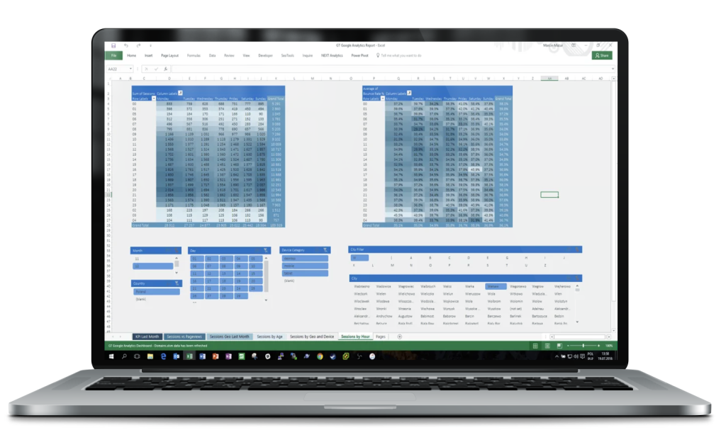
Why does it work?
- It helps discover when users are most engaged and when they are only briefly visiting the site.
- Enables adjusting ad campaigns or content publishing to actual hours of activity.
- Conditional formatting makes interpreting data easier without advanced analysis.
Result? Less guessing, more data. And even faster.
Average Time on Site – Demographics and Location
This view enables detailed analysis of the average time users spend on the site, broken down by age groups, gender, and region. Thanks to layered visualization and dynamic filters, it’s easy to quickly spot which user group is the most engaged and which is the least.
- On the left – a stacked chart illustrating changes in average time on site month by month.
- On the right – a pivot table showing exact values of average time on site by age group and month.
- At the bottom – segmentation by gender, age, and region.
Practical applications:
- Ability to compare user behaviors across different regions and demographics.
- Quick identification of which groups are worth serving better or targeting more actively.
- Enables adjustment of campaigns and content to the most engaged segments.
Result? Less guesswork, more real engagement data.
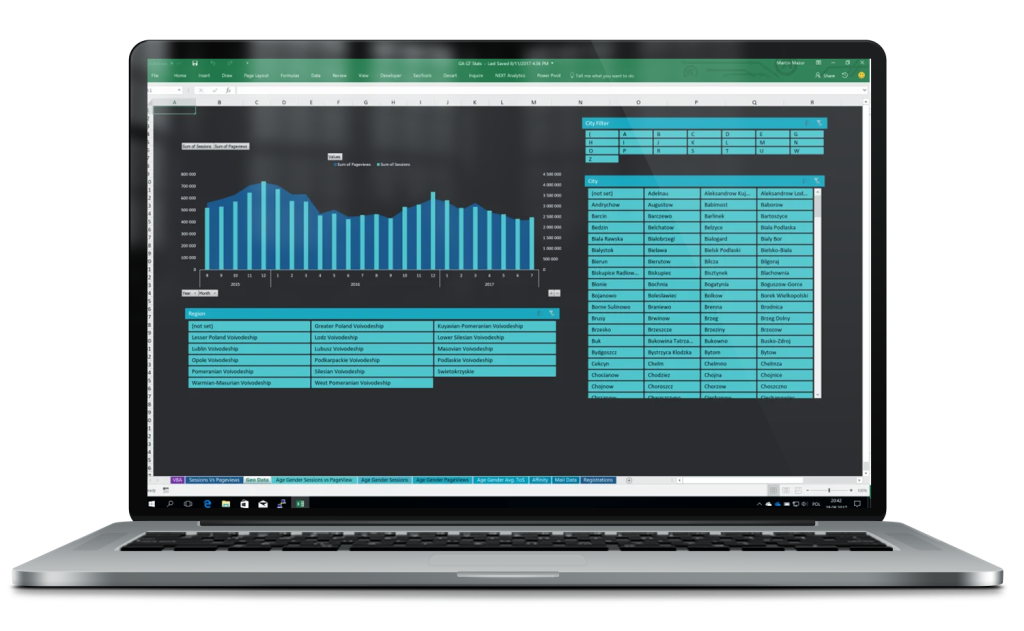
Session and Pageview Trend Analysis – Over the Years
This is a comprehensive view that displays trends in the number of sessions and pageviews broken down by years and months. The report provides an instant insight into the health of the site and the results of promotional activities over a long time horizon.
- The main part of the dashboard presents a bar chart (number of sessions) and a line chart (number of pageviews), synchronized on a timeline.
- At the bottom – dynamic filters allow data analysis by year, month, country, and device category (desktop, mobile, tablet).
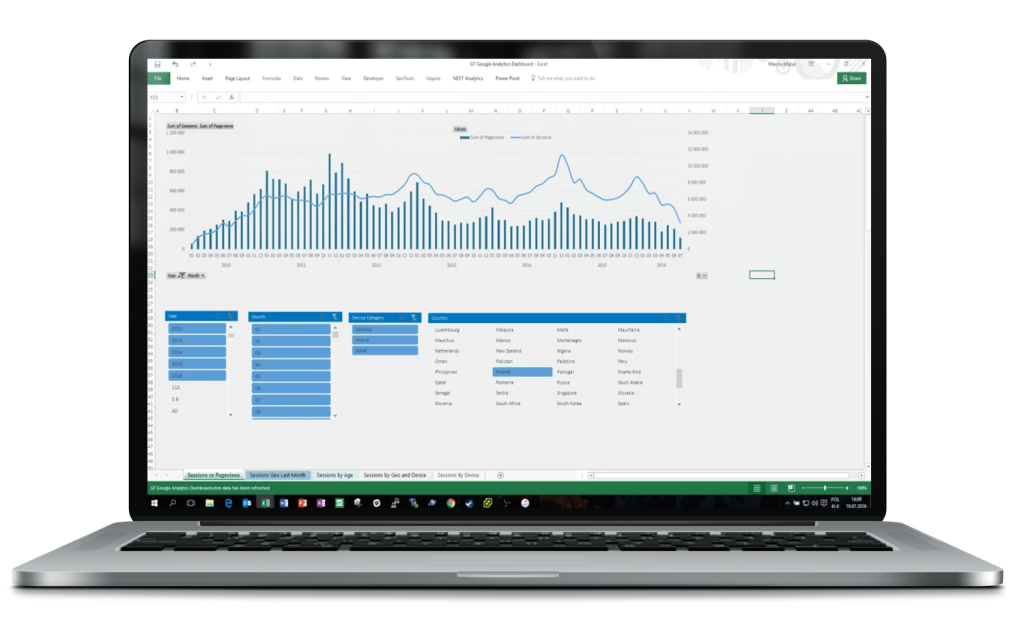
Practical applications:
- Identifying moments of traffic spikes/drops (e.g., campaigns, redesigns, technical errors)
- Comparing user activity across years and seasons
- Quick segmentation by country and device – e.g., desktop vs mobile in a given year