Iris was born from an observation that repeated itself in every industry, every company, and every project. The data exists. It always does. It sits in databases, ERPs, Excel spreadsheets, financial models, and operational systems.
The people who should see it — don’t. Not because the data is missing, but because there is no layer that turns it into a clear picture.
Iris is that layer.
An interactive visualization layer built in React that connects to any data source and transforms it into real-time dashboards — without exports, without refreshing files, and without waiting for reports. One interface. Multiple systems.
The problem Iris solves
Every organization, at a certain stage of maturity, hits the same wall. There is a lot of data. There are many systems. But the right information doesn’t reach the right person at the right time.
What reality looks like without Iris
Results from a financial model sit in an analyst’s Excel file. Warehouse status is in the ERP. Sales data is in a salesperson’s spreadsheet. Cashflow is in a file emailed two weeks ago.
The board wants to know how the company is doing. Now. Not at the end of the month when someone finishes “clicking together” a report.
Each department delivers data in a different format, on a different scale, and at a different time. Trying to compare them feels like assembling a puzzle from three different boxes.
The most important information travels in email attachments and PDFs that cannot be filtered, zoomed, or verified. The report lands on the desk showing a situation from several days ago. You are managing the company by looking in the rear-view mirror — not through the windshield.
You see an anomaly on a chart but cannot click the number to check where it comes from. You have to ask an analyst for another report. And wait.

What Iris changes
Instead of decision paralysis — one unified view of data from all systems in a single place.
Instead of manual distribution — a dashboard that is always available to everyone who needs it. No attachments, no PDFs, no Slack messages.
Instead of a rear-view mirror — data updates automatically. You see what is happening now — not a week ago.
Instead of waiting for an analyst — you click a number and drill down yourself. Drill-down, filters, export — all within one click.

The principle is simple: an invoice arrives, Echo automatically parses its content, recognizes the supplier, and suggests assignment to cost categories based on procedure and previous decisions history.
A person opens the Excel sheet, sees the ready proposal, and confirms with one click. Or makes a correction. Whatever was corrected once — Echo remembers. The rest happens automatically.
Echo is not an accounting system. It operates in the layer before accounting and answers completely different questions: what does this expense mean for the company’s result now, are the costs within plan, what will leave the account and when, where are the deviations before they become a problem.
Architecture — how Iris connects to your data
API-First — Iris speaks with every system
Iris is not another BI tool that requires data migration or infrastructure replacement. It connects to what you already have — via API, direct SQL access to the database, or through an intermediary layer (Clio) that aggregates data from multiple sources.
MySQL, PostgreSQL, MongoDB, REST API, Excel — Iris is not picky about input format. It is demanding when it comes to the quality of the output image.
Clio — central data aggregator
Clio is the intermediary layer of the Origami Effect ecosystem. It collects data from specialized financial and operational models (Excels, industry systems, ERP), processes it, and exposes it through standardized API. Iris pulls data from Clio and turns it into views.
This solution is especially useful when data lives in many different places — Clio cleans it up, Iris shows the result.
React — why not PDF, PowerPoint, or spreadsheet
PDF only shows — Iris answers questions. Data in Iris refreshes automatically with no expiration date. It works on every device: phone, tablet, laptop, boardroom monitor — the same view, the same interactivity.
Click a number and see what it consists of. Filter by district, product, department, or year. Drill down from general to specific without requesting another report. Everyone sees what they need — not one report for everyone.
What Iris does with data — the visualization layer
Iris is not a dashboard template. Every view is designed for a specific system, specific role, and specific decision-making questions it needs to support.
Interactive charts and statistical analysis
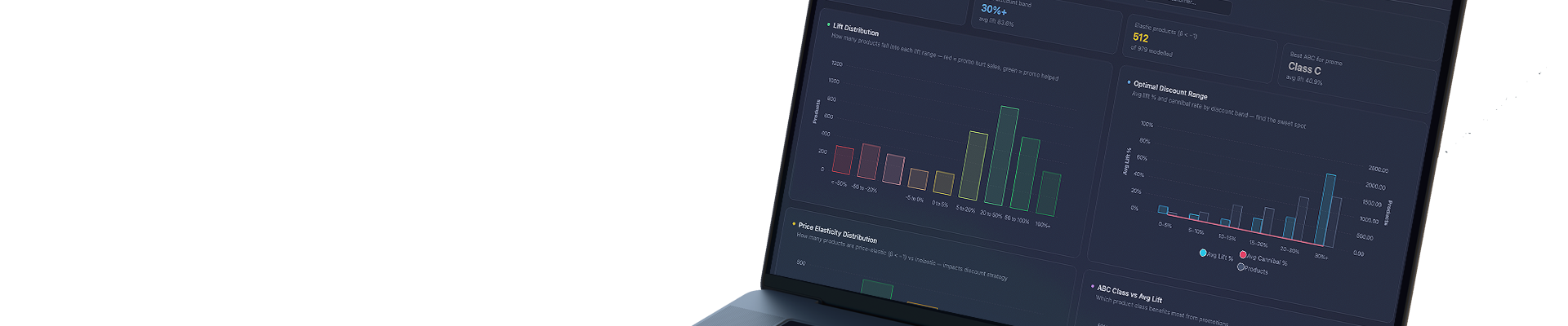
Scatter plots, violin charts with KDE, histograms, CDFs, bubble charts, multidimensional line trends, stacked charts — Iris uses the full spectrum of modern visualization libraries (Recharts, D3.js, Plotly). Every chart is interactive: tooltips, zoom, click filtering, drill-down to record level.
Maps and geographic data
When data has a spatial dimension — Iris displays it on a map. Geo Revenue Map, density heatmaps, points with color and size encoding for additional data dimensions. Technology: Deck.gl, CARTO, OpenStreetMap.
Operational tables with business logic
Not every piece of information is a chart. Iris also builds interactive tables with sorting, filtering, conditional coloring, and export — powered by live data, not static exports.
Real-time scorecards and KPIs
Management views: key metrics with dynamics (vs. plan, vs. previous period), colored deviation signals, plan vs. performance vs. delta comparisons — all updated automatically with every change in the source data.
Historical snapshots and trend analysis
Iris can remember the state of data at defined moments and allow comparison of “today” with any point in the past. Switch snapshots with one click — all charts update instantly.
Iris and AI — a chart that tells you what it means
A chart without context is just a shape on the screen.
Iris has a built-in AI layer that does not replace the analyst — it complements them. For every view, there is an option for AI interpretation. The system analyzes the data it currently sees — not general industry knowledge — and formulates a comment in natural language.
It explains what you’re seeing. Instead of just a chart, you get a comment that tells you what it means in the context of your business.
It highlights anomalies — the system notices deviations that are easy to miss and draws attention to them before they become a problem.
It answers questions — ask in natural language, Iris responds based on your data.
It regenerates interpretation on demand — after every data update or filter change, you can ask AI for a fresh analysis.

Origami Effect Dashboard Ecosystem
Iris is the visualization layer. Data is supplied by specialized analytical systems built by Origami Effect for specific industries and processes.
Quantis — import and distribution companies
Central analytical-predictive system for import companies. ML demand forecasting (XGBoost + Facebook Prophet), dynamic ABC classification, operational alerts, promotion and price elasticity analysis. Iris visualizes Quantis data as dedicated sales, warehouse, forecasting, and operational dashboards.
Themis — real estate market
Real estate market analytical model. Aggregates listings, price per m², size data, and short-term rental data (AirROI). Iris visualizes it with violin charts, CDF, scatter plots, geo revenue maps, and historical market snapshots. A tool for investors, funds, and family offices.
→ Learn more about Iris · Themis
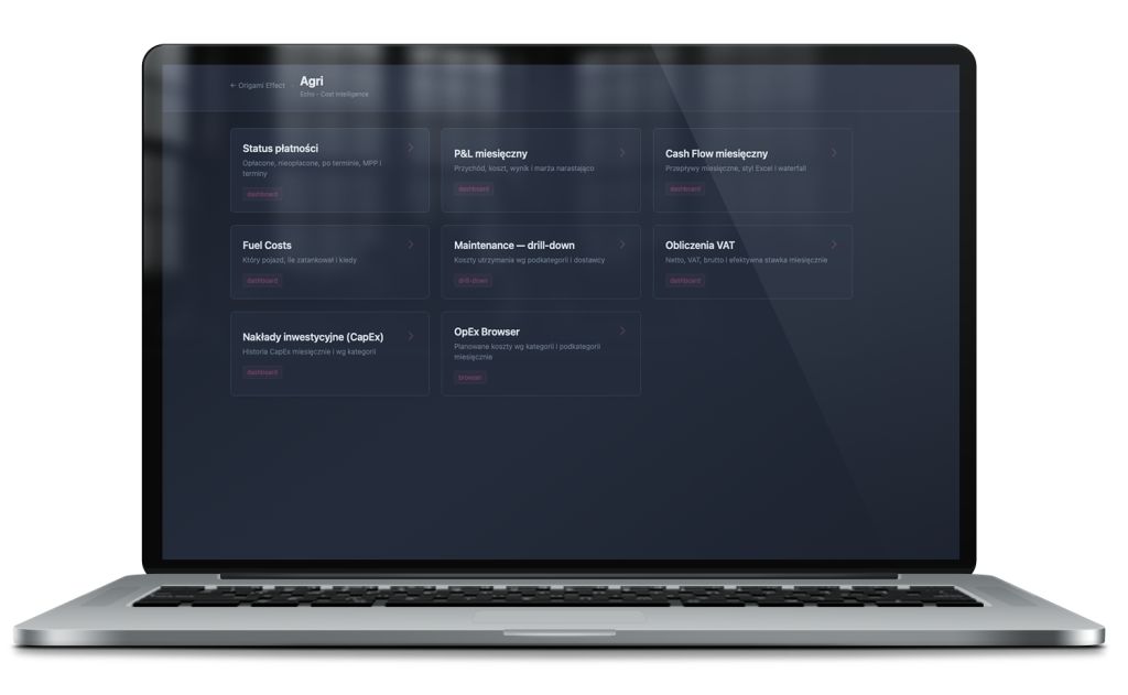
Demeter — agricultural farm
The most advanced financial-operational model for farms — built in Excel, feeding Clio. Iris turns it into an interactive controlling dashboard: milk production, feed requirements, herd, OFC, loans, etc.
→ Learn more about Iris · Demeter
Artemis — investment projects
Advanced financial model for investment projects — DCF, CapEx, revenue structure, P&L, balance sheet, cashflow. Iris turns it into an interactive dashboard with scenarios (A, B, C, D, E, Baseline) switched with one click.
→ Learn more about Iris · Artemis
Metis and more
The Origami Effect ecosystem keeps growing. Any system that produces data — proprietary, industry-specific, or operational — can have its own view in Iris.
Implementation effects — what changes in practice
- No more on-demand reporting. Information exists all the time — not when someone manages to prepare it. The board stops waiting. The analyst stops being a bottleneck.
- Decisions made on current data. Not on what someone managed to prepare — but on what is actually happening in the company right now.
- One view instead of many files. Instead of puzzles from three different boxes — one screen that combines data from all systems.
- Everyone sees what they need. The owner sees the big picture. The salesperson sees their portfolio. The logistician sees orders. One system, multiple roles, each with the right view.
- Less time preparing, more time interpreting. When data is not unified, people waste 80% of their time preparing visualizations and only 20% interpreting them. Iris reverses these proportions.
Who stands behind Iris
Iris is a tool designed by someone who understands business from the inside — with experience in investment project execution on the fund side, and in building analytical systems for companies from very different industries: from importers managing thousands of SKUs, through farms calculating the cost of a liter of milk, to currency exchange platforms overseeing 15,000 transactions and development projects.
This experience provides something no tool can replace — the ability to ask the right question before building begins. What is really worth reporting? Which data influences decisions and which only clutters the screen? How to build a system that serves leaders — not just analysts?
Implementing Iris is not software installation. It is jointly designing how data in your company should work — and building a system that makes it happen.
FAQ
Does Iris replace existing BI tools (Power BI, Tableau)?
Iris and tools like Power BI solve different problems. Power BI is a general-purpose tool designed for self-configuration by the user from ready components. Iris is a purpose-built visualization layer — every view is designed for a specific system, role, and decision-making needs. Iris has no “drag and drop” interface — it has exactly the views your company needs and nothing redundant.
Does Iris require replacing the existing ERP or system?
No. Iris connects to the data you already have. The ERP remains the system of record. Iris becomes the visual layer that turns this data into an accessible picture without logging into the ERP.
How long does implementation take?
Implementation time depends on the complexity of data sources and the number of views. Iris does not require changing operational processes — it extends them with a visualization layer. The first version of the dashboard is usually ready within a few weeks of starting the project.
Does Iris work on a phone?
Yes. Iris is built in React with a responsive layout. It works identically on a phone, tablet, and boardroom monitor — through the browser, no dedicated mobile app required.
Are the data in Iris secure?
Iris runs on the client’s infrastructure or a dedicated cloud environment with per-user access control. Data never leaves the client’s environment — Iris is a visualization layer, not a new database.
Can data be exported from Iris?
Yes. Export to XLSX and PDF is available with one click from any tabular view. Iris does not lock the data — it makes it available in the format needed at any given moment.
For which industries does Iris have ready solutions?
Origami Effect has implemented systems for: import and distribution companies (Quantis), real estate market (Themis), agricultural farms (Demeter), and investment projects (Artemis). Any system that produces data can have its own view in Iris — industry is not a limitation.
What does cooperation look like after implementation?
Iris is a living tool — not a project that closes and gets put on a shelf. Origami Effect remains a long-term technical partner: monitoring the system, optimizing views, and expanding them as the company grows. Market physics change — the system should keep up.