

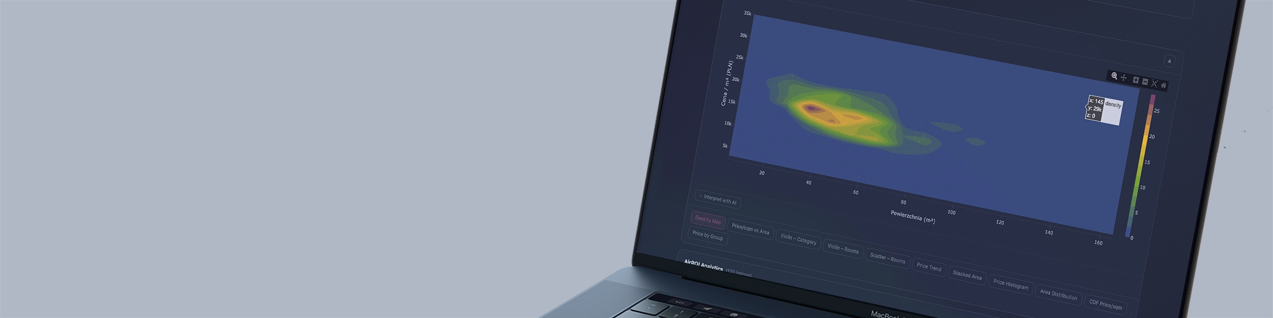
How to analyze the real estate market?
Iris for the real estate market was created from a very specific observation. Investors, funds, and family offices make decisions involving millions of zlotys based on PDFs dated a week ago, Excel tables updated by someone before a meeting, and market averages that hide more than they reveal.
The data exists. There are thousands of it — listings, transaction prices, areas, occupancy, rental revenues. The problem is not the lack of data. The problem is the lack of a layer that can turn it into a current, interactive picture ready for decision-making — without involving an analyst, without waiting for a report, without opening a file.
Iris is that layer. Powered by one of Themis modules — the analytical model of the real estate market — it visualizes a live picture of the market in real time.
One screen. 1,951 listings. Historical snapshots. Drill-down to a specific segment. No intermediaries.
The problem solved by Iris · Themis
The real estate market produces a huge amount of data. Listing portals, transactional data from land registers, Airbnb data, asking price registers. Each of these sources separately is only a fragment of the picture.
The problem is not data availability — it is their dispersion, inconsistency, and the lack of an interpretive layer that can answer a specific investment question: where to buy, in what area size, in which district, and at what price — to achieve the assumed return.
What reality looks like without Iris · Themis
Investment decisions are made based on general GUS statistics or averages from portals — numbers that are delayed, aggregated, and useless at the micro-investment level.
Analysis of a specific district or area segment requires hours of manual work in a spreadsheet.
Comparing today’s market with the one from a quarter ago requires two separate reports and manual combination.
Data on short-term rental potential (Airbnb, Booking) is in a different place than purchase price data — no one combines them in one view.
A fund, family office, or private investor operates on intuition reinforced by selected data — not on a complete model.
What Iris · Themis changes
Iris visualizes the Themis model as an interactive dashboard available in the browser — on a phone, tablet, or boardroom screen. Data updates automatically with every new market snapshot. No exports. No file refreshing. No question “is this the latest version”.
The investor clicks. Drills down. Answers their own questions.
System architecture — how Themis and Iris process data
First layer: Themis — real estate market analytical model
Themis Real Estate is the central data processing engine. It aggregates real estate listings, processes, cleans, and loads them into a consistent database in cycles defined by the schedule. Each listing has assigned: district, area, number of rooms, total price, price per m², price category, and geographic coordinates.
Themis remembers the state of the market at historical moments — creating snapshots that allow comparison of today’s market with the one from a month, quarter, or year ago.
Second layer: AirROI — short-term rental model
A separate branch of Themis aggregates data from short-term rental listings (Airbnb and similar). For each listing, it calculates: ADR (average daily rate), occupancy (%), estimated annual revenue, property type (entire home vs. private room), and geographic location.
This allows comparing the purchase cost of a property with the real revenue potential from short-term rental — not based on portal declarations, but on observed market data.
Third layer: Iris — visualization in React
Iris is an interactive visual layer built in React. It connects to the Themis API and renders data as interactive charts, maps, and tables. Every view is responsive — it works identically on a phone and on a 4K monitor in a conference room.
The user does not see the database. They see a picture of the market ready for interpretation.
API-First — Iris talks to any tool
Every value calculated by Themis is available via API. Dashboards, financial models in Excel, internal reporting systems, investor presentations — all can be fed from one consistent data source.
What Iris · Themis calculates and visualizes
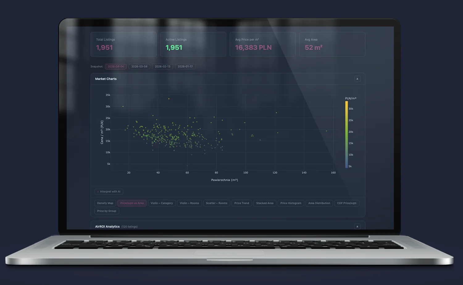
Price/sqm vs Area — where is the opportunity, where is the overpayment
Scatter plot of every listing on the market with three-dimensional data encoding: X-axis is area, Y-axis is price per m², color is price level (viridis scale). The negative correlation between area and price per m² is immediately visible — small apartments are expensive per m², large ones cheaper, but the absolute price limits the pool of buyers upon exit.
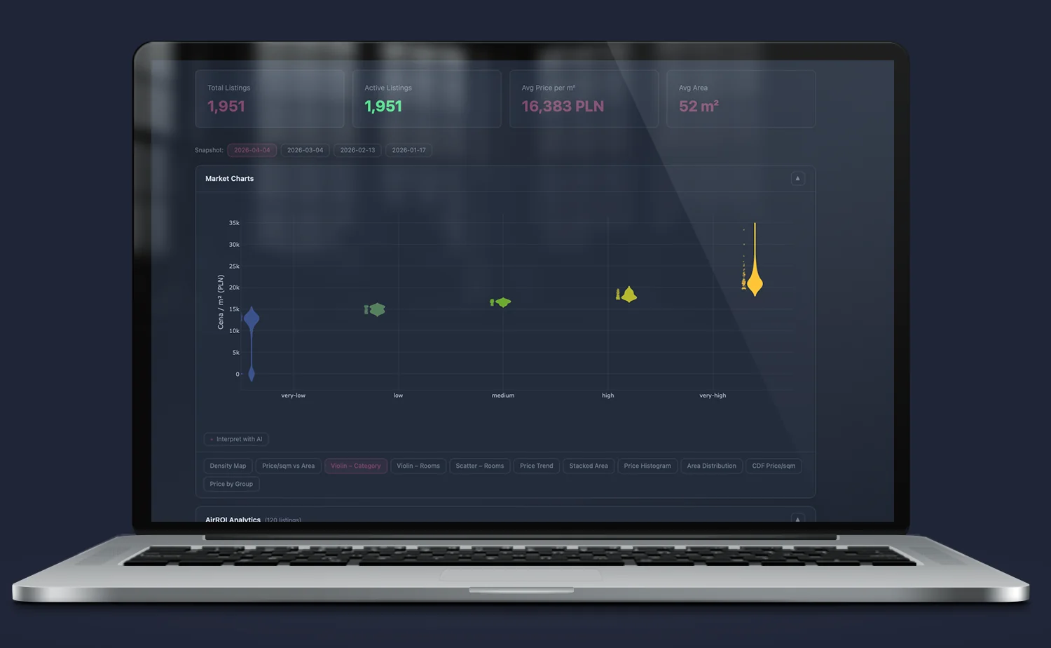
Violin Chart — price distribution by number of rooms (KDE)
Instead of an average bar — a full statistical distribution. Kernel Density Estimation (KDE) for each room segment shows not only where the median lies, but how wide the price spread is, where outliers are, and where the mass of listings is concentrated. The IQR box (Q1–Q3) and median line are immediately visible.
This is a tool that separates homogeneous markets from those with high variability — key when assessing risk in a specific segment.
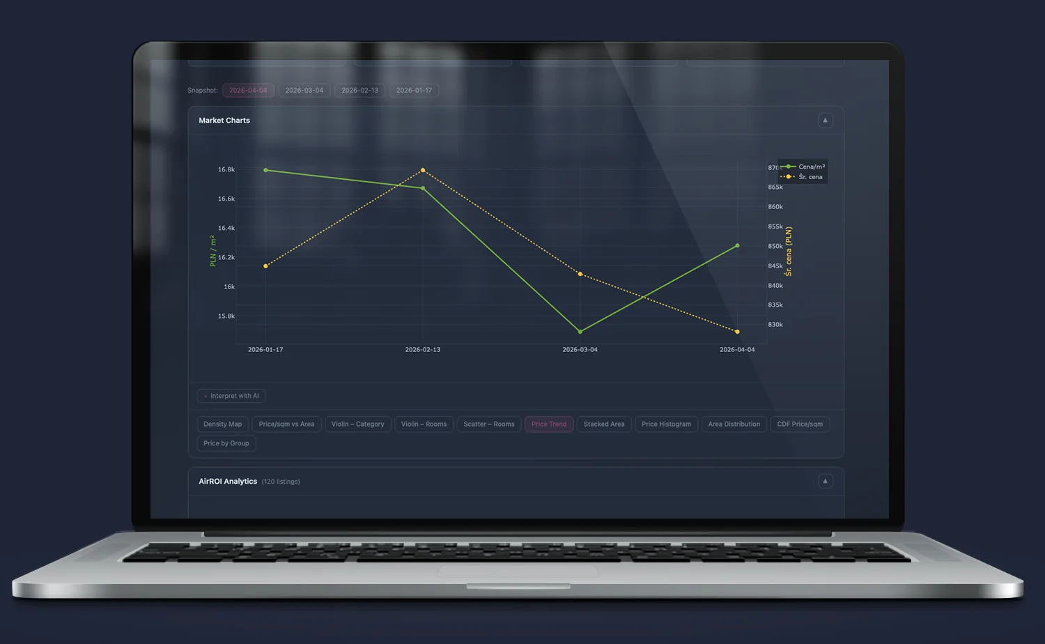
Price Trend — price dynamics over time
Linear price/m² trend for six districts simultaneously, at four time points. You can see which districts are growing faster, where growth is accelerating, and where the market is stable. This is not a forecast — it is an observation of actual price changes between successive Themis snapshots.
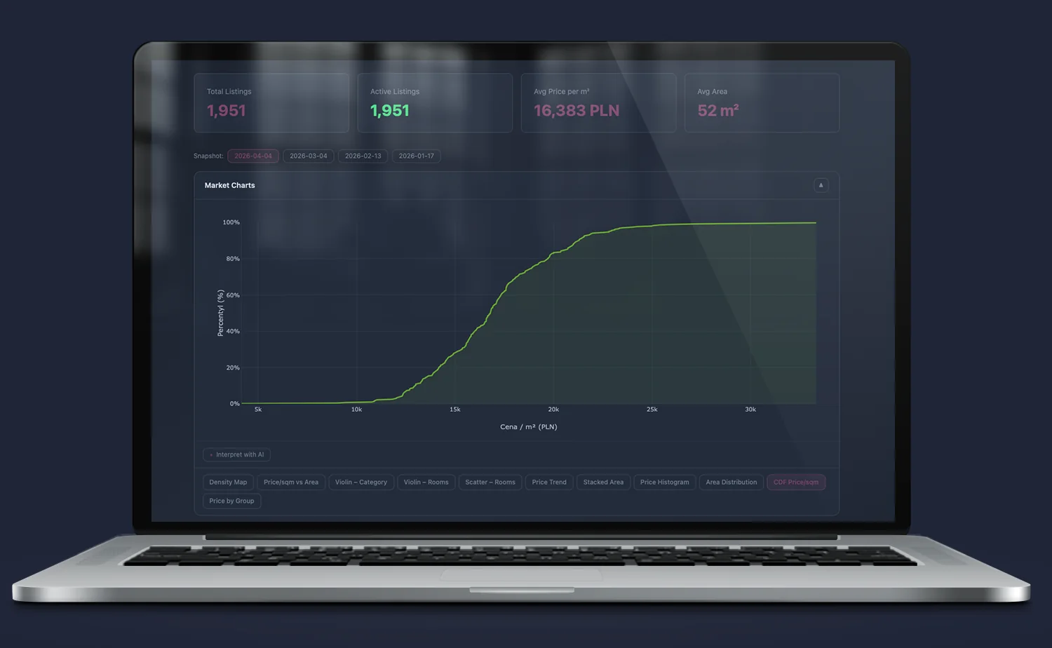
CDF Price/sqm — market percentiles
The empirical cumulative distribution function (CDF) allows answering one of the most important investment questions: what percentage of the market is below a given price? Reference lines P25, P50, P75 are immediately visible. Purchasing below P50 means that upon exit, more than half of the market buyers have a budget for this property.
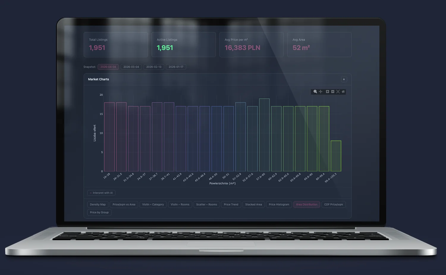
Area Distribution — market depth by area
Area histogram shows where supply is concentrated. The 35–60 m² segment accounts for over 60% of the market — maximum liquidity upon exit. The right tail signals the rarity of large units and their reduced transactional liquidity.
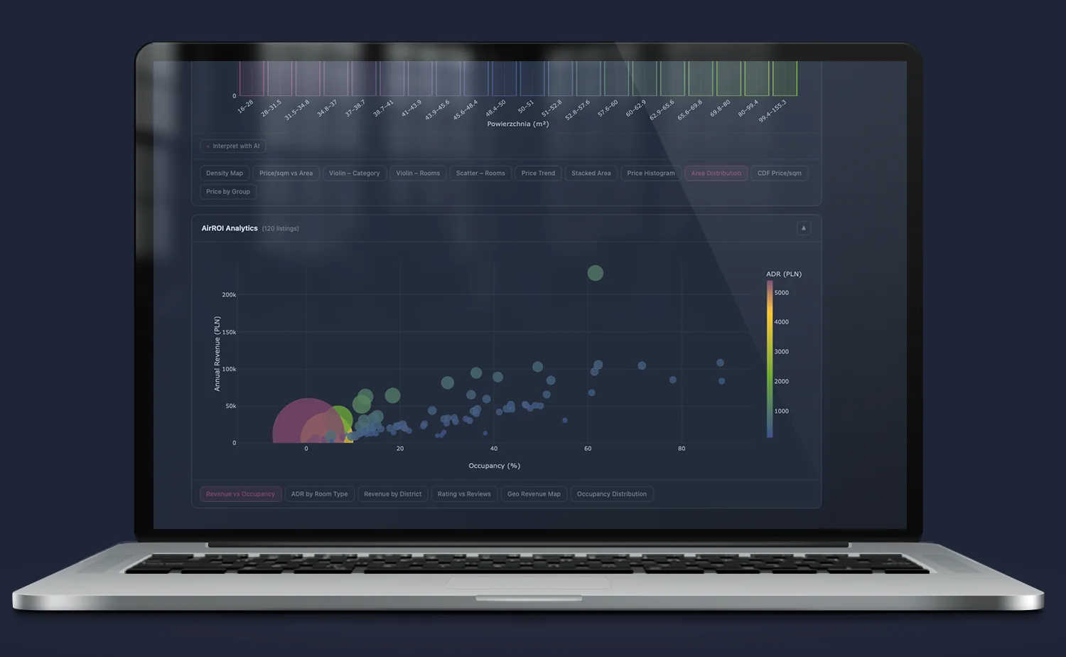
Revenue vs Occupancy — AirROI bubble chart
Three-dimensional bubble chart: X-axis is occupancy (%), Y-axis is annual revenue (PLN), bubble size and color is ADR (average daily rate). Three clusters are immediately visible: high occupancy + high ADR (top performers), middle (optimization potential), and those that don’t earn. High ADR without occupancy does not generate return — this chart proves it empirically.
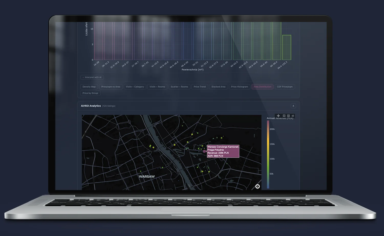
Geo Revenue Map — geographic revenue map
Every listing plotted on the Warsaw map with color encoding annual revenue (color scale). You can immediately see where geographically the highest-revenue listings are concentrated — and where an address looks good on paper but the STR market does not reward it.
Historical snapshots — the market over time
Themis remembers the state of the market at specific moments. Iris allows switching between snapshots with one click — and instantly comparing today’s market structure with the one from a quarter ago.
You can see which districts have accelerated, where new listings appeared in a segment that was previously empty, and how price percentiles have changed. This is a tool for the investor who wants to see the trend before the competition notices it.
AI Layer — Iris explains what you see
A chart without context is just a shape on the screen.
Iris has a built-in AI layer that does not replace the analyst — it complements them. For every view, there is an “Interpret with AI” button. The system analyzes the currently displayed data and formulates an interpretation in natural language: what this distribution means, what anomalies are visible, what to pay attention to before making an investment decision.
AI in Iris does not answer general questions about the market. It answers based on the data it currently sees — specific listings, a specific snapshot, a specific district.
Implementation effects — what changes in practice
- Investment decision in minutes instead of weeks. Data that previously required a week of analyst work is available immediately, in one view, ready for interpretation.
- No more decisions based on averages. Iris shows the full price distribution — not only where the average lies, but how wide the spread is and where the outliers are. This is a fundamental difference when assessing risk.
- Real-time verification of investment thesis. “Praga is undervalued and will grow” — this is not a thesis. It is a hypothesis. Iris allows verifying it on hard data: growth pace vs. other districts, market depth, STR potential.
- ROI from short-term rental without guessing. AirROI data combines location with real rental revenue. The investor sees not “potential” — they see actual results of listings in the same location.
- One view instead of three reports. Purchase market data, STR data, and historical trends in one interface. No combining files, no asking an analyst for a summary.
FAQ
Where does the data in Themis come from?
Themis aggregates data from publicly available sources and data provided by Origami Effect clients. The data is processed, cleaned, and loaded into a central MySQL database in automatic cycles. Every snapshot is archived — enabling trend analysis over time.
Does Iris require replacing the existing ERP or system?
No. Iris connects to the data you already have. The ERP remains the recording system. Iris becomes the visual layer that turns that data into a picture accessible without logging into the ERP.
Does Iris work on a phone?
Yes. Iris is built in React with a responsive layout. It works identically on a phone, tablet, and boardroom monitor. The same view, the same interactivity, without a dedicated mobile app.
Does Iris replace the analyst?
No. Iris removes the bottleneck between data and decision — but does not replace expert judgment. The analyst stops spending 80% of their time preparing visualizations and 20% interpreting them. Iris reverses these proportions.
Iris is everywhere there is data
Themis is one of the systems that Iris supports. The same philosophy extends to everything that produces data.
Quantis — operational analytics for import companies, ML demand forecasting and inventory management.
Artemis — interactive DCF with scenarios for investment projects.
Demeter — farm controlling with accuracy unmatched by any system on the market.
Every system that produces data can get its own view in Iris. Every owner, management board, CFO, and investment committee can see what matters — without involving an analyst, without waiting for a report, without opening a file.
One interface. Unlimited possibilities.
Do you need someone who instantly understands the problem — and knows what to do with it?
Most companies have data. What’s missing is the idea of what to do with it — and someone who will actually execute it. Origami Effect provides both.