
User account registration monitoring for a web portal
Delivered in 2016
Project objective
To design a system that enables monitoring of the dynamics of user account registrations on a web portal, along with analysis of acquisition sources, preferences and potential value over time.
Challenge
At the time of delivery, the project had to be built on data from a massive database (over 100 tables and 15 GB of data), pulled from MySQL directly into Excel 2016 with the PowerPivot add-in. The key challenge was combining data from many different sources and keeping it up to date without any manual processing.
A solution was needed that would enable:
- monitoring of daily, weekly and monthly registrations,
- analysis of age structure and platforms (PC, Xbox, PlayStation),
- tracking of social account activity (Facebook, PSN, Xbox Live),
- modelling of user growth over time (growth forecasting),
- analysis of user acquisition cost and estimated lifetime value (LTV).
Solution
An analytical system was built on Excel Power Pivot and DAX that:
- automatically retrieves data from MySQL views optimised for analysis,
- enables analysis of daily, weekly and monthly registrations,
- allows segmentation by age, platform and registration source,
- supports analysis of account quality (e.g. whether a date of birth was provided, whether the account was linked to FB, PSN or Xbox),
- enables modelling of user growth and acquisition cost.
Results
- Full real-time control over the user base.
- Ability to model campaigns for acquiring new players.
- Identification of high-value users and potential VIP segments.
- Foundation for further LTV, margin and secondary-market revenue forecasting.
Automatic data refresh from the MySQL database
The screen above shows the source worksheet, which pulls data directly from the relational MySQL database — with no manual export and no involvement from the IT department.
Key elements:
- The user table view contains fields including email address, registration date and account activation date.
- The “Data Refresh Progress” panel confirms that the data has been successfully updated — retrieved directly from the SQL view.
- The ability to refresh the entire Power Pivot model with a single click, ensuring analysts always work with up-to-date data.
Result:
Instead of manually copying data from reports, analysts can work with a live database — analysing registrations, account activations and user segments in real time.
Dynamic analysis of account registrations and activations
The screen shows the main analytical dashboard, which allows tracking of how the number of user account registrations and activations changed over time.
Key elements:
- The upper chart shows the daily number of new accounts, with the ability to filter data by age, platform or social account status.
- The lower chart aggregates data monthly, making it easy to spot seasonal trends and evaluate the results of ongoing campaigns.
- Slicers on the left enable instant segmentation — for example, accounts linked to PSN only, users aged 25–34, and so on.
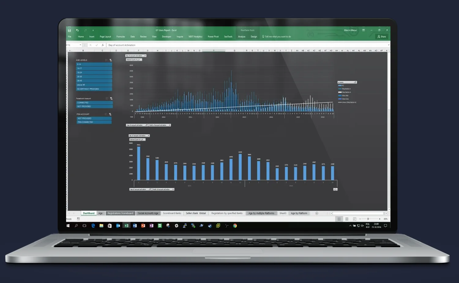
Result:
Users can analyse historical and current data without any knowledge of SQL — a few clicks are all it takes to check the effectiveness of marketing activities, registration campaigns or a specific traffic acquisition source.
Detailed daily user registration chart
The screen shows a single bar chart presenting the daily number of user registrations over several months.
Key elements:
- The chart allows identification of registration spikes that may correspond to specific campaigns, game launches or promotional activities.
- The time axis and bar values are fully dynamic — they can be filtered using slicers available in other views.
- Bars include labels with the exact number of registered accounts, enabling instant analysis of effectiveness on any given day.
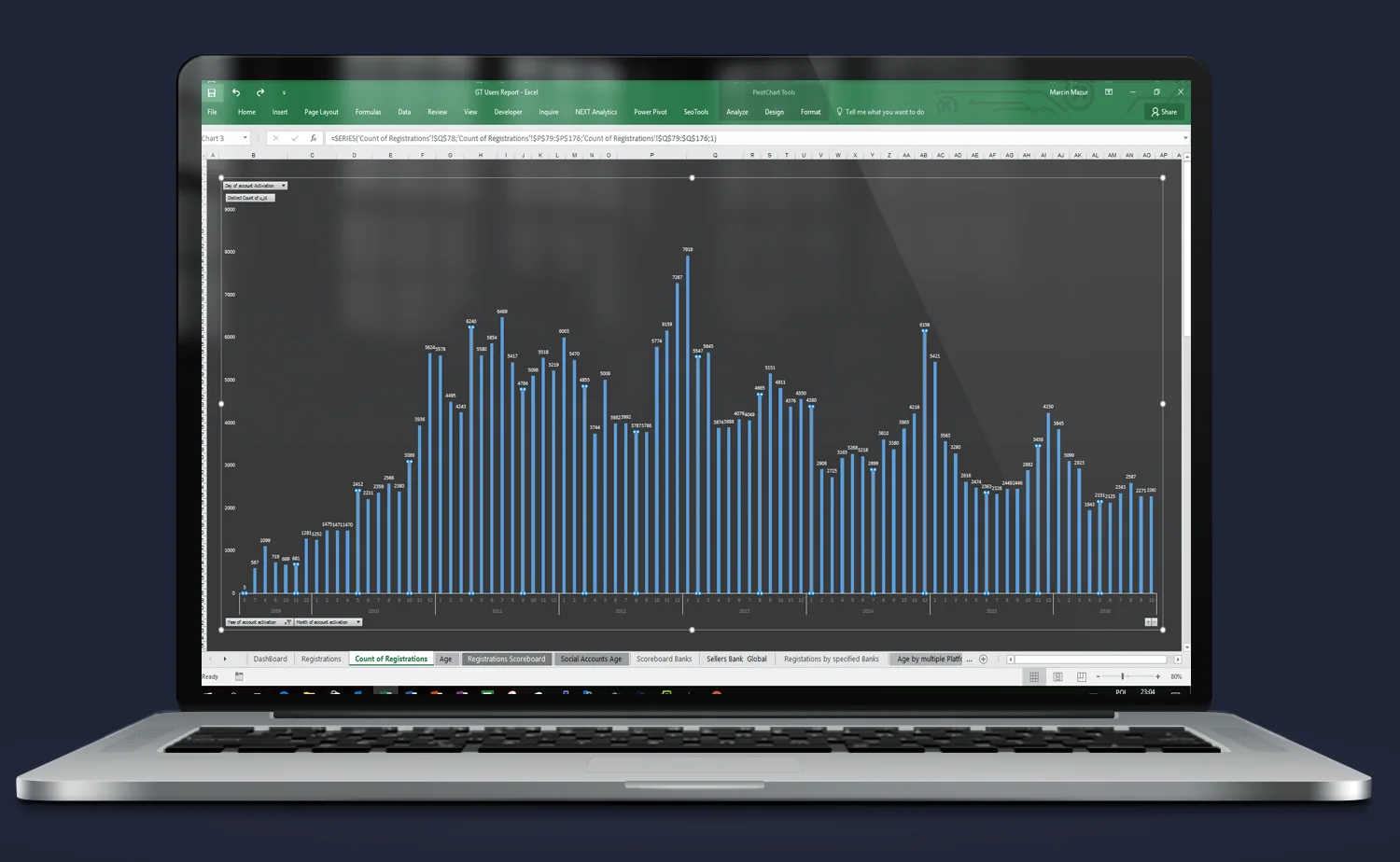
Result:
This is an ideal tool for daily monitoring of marketing effectiveness and for responding to changes in user activity in real time.
User age structure and data quality
The screen above presents a demographic analysis of portal users, broken down by age group and completeness of the data provided.
Key elements:
- A horizontal bar chart showing the number of accounts in each age group (e.g. 15–24, 25–34).
- A “NO BIRTHDAY PROVIDED” category is also visible, enabling an estimate of data collection quality.
- The slicer on the left allows age structure analysis in the context of other criteria — for example, only users with a linked social account or those registered in a given year.
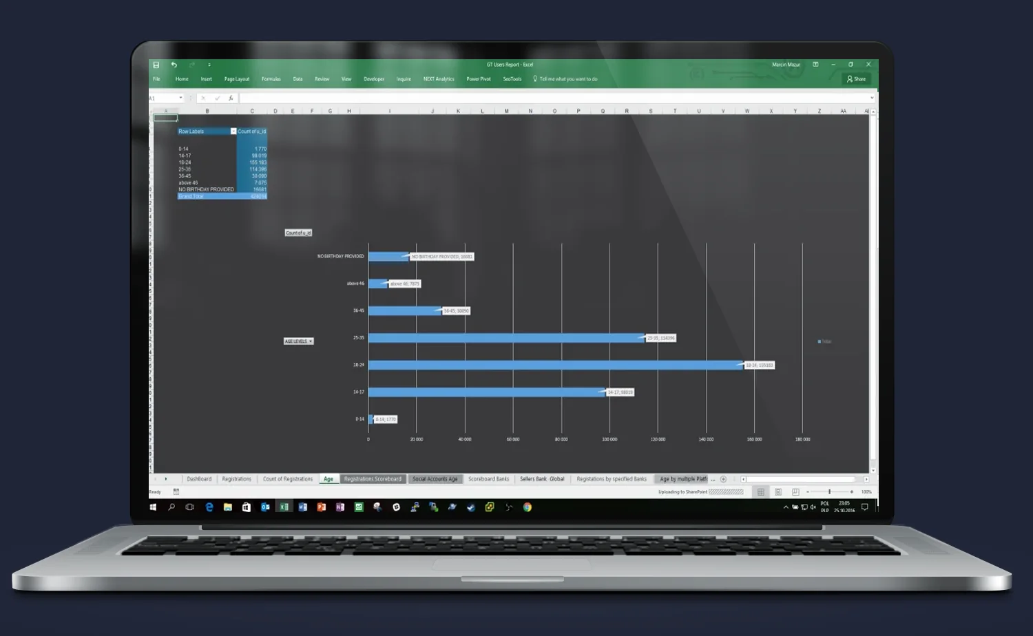
Result:
This view enables:
- a better understanding of who actually uses the portal,
- segmentation of marketing communications by age,
- identification of which age groups are worth activating or retargeting.
User account connections to social platforms
This screen presents a breakdown of user demographic data depending on whether their account has been linked to external platforms: Facebook, PSN, Xbox Live.
Key elements:
1. A pivot table combining age data with account connection status.
2. For each age group, the number of users is shown:
- with a linked account (CONNECTED),
- without a link (NOT CONNECTED),
- or with no data provided (NO BIRTHDAY PROVIDED).
3. The tables allow instant assessment of which age segments are more inclined to integrate with external platforms — which is relevant for retargeting campaigns and data integration.
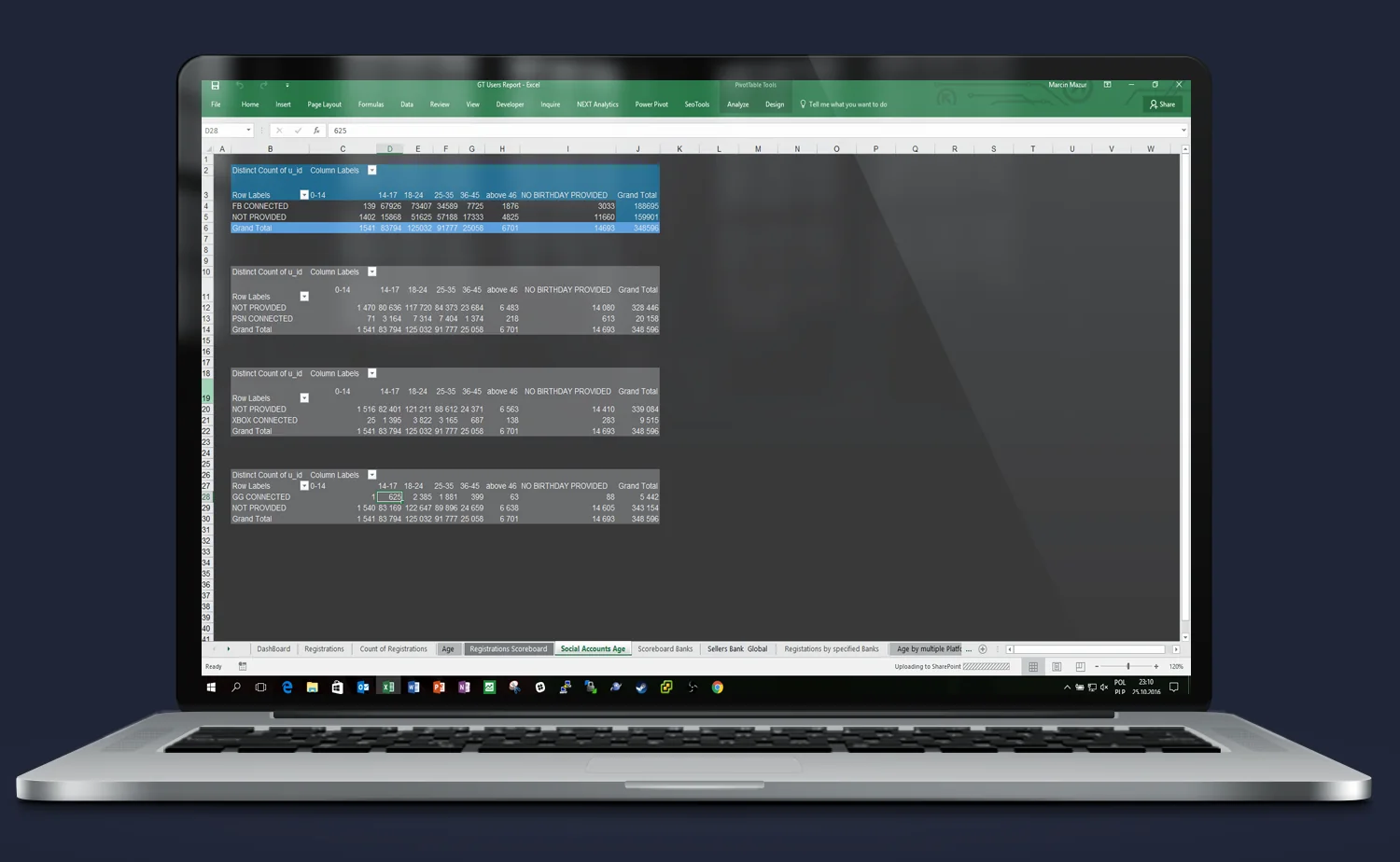
Result:
This analysis enables:
- identification of the most engaged users,
- design of campaigns targeting groups with high conversion potential (e.g. PSN-linked users aged 25–34),
- planning of activities based on the user’s cross-platform presence.
Comparison of registration and activation trends over time
The screen shows a dual line chart layout enabling deeper analysis of user behaviour trends — not only in terms of registration numbers, but also activations and ongoing engagement.
Key elements:
- The upper chart shows the variability in new account numbers over time — broken down by segments such as registration source or platform type.
- The lower chart shows more aggregated values, e.g. monthly or quarterly growth — ideal for planning and strategic comparisons.
- The ability to dynamically switch between views and compare different datasets over time is clearly visible.
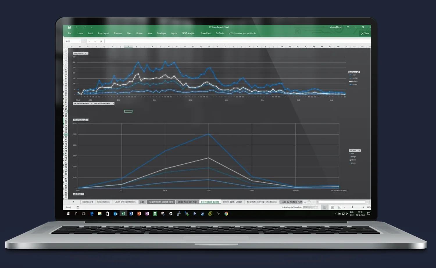
Result:
Users can not only monitor current results, but also:
- detect drops and spikes in registrations and their causes,
- compare different user acquisition sources and their effectiveness over a longer timeframe,
- use the data for forecasting and planning future marketing activities.
Need someone who understands the problem instantly — and knows what to do about it?
Most companies have data. What they lack is an idea of what to do with it — and someone who will actually execute it. Origami Effect delivers both.