

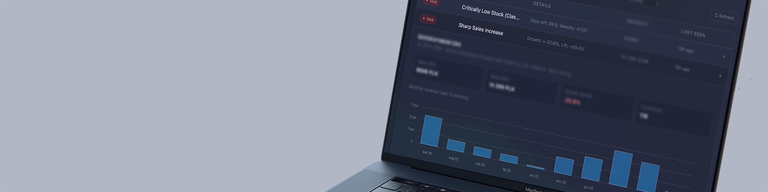
Iris for Quantis – Interactive Analytical Dashboards
The Quantis system automatically processes data in the background: it forecasts sales, detects risks, calculates margins, and classifies products. The problem is that the results of these calculations live in the database — and are only available to someone who knows how to query the database.
Iris solves this problem. It is the visual layer of the Quantis system — a set of interactive dashboards built in React that turn raw analytical data into views tailored to the role of the person using them.
The owner sees what the owner wants to see. The salesperson sees what the salesperson needs. The logistician sees their numbers. Everyone — without logging into the ERP, without exporting Excels, without asking anyone for data.
What is Iris and where does it come from
Iris is a separate system. It is a data visualization interface.
Quantis calculates and stores dozens of indicators for every product, customer, and process in the company in a central database. Sales history, forecasts, inventory levels, ABC classifications, churn risk, promotion results, margins — everything is there. Iris exposes this data via API and renders it as interactive views in the browser.
No data is stored in the dashboard. Every view refresh is a query to the Quantis API. The data is always up to date — as current as the last Quantis analytical cycle.
Three-layer architecture
Comarch ERP Optima
Quantis Core & API
Iris Dashboards
The ERP is the source of raw data. Quantis is the engine that processes and calculates it. The API is the bridge. Iris is the window — through which everyone in the company can view the results without technical knowledge.
Who is Iris for — role-based views
Iris does not have one dashboard for everyone. Each role in the company has its own view — built around the questions and decisions that role makes.
Owner and management
Strategic view. Business health in one place — without digging through department reports. Turnover, margin, capital rotation, top customers, top products. Signals that require management decisions. Trends that the ERP will only show in a month, when someone prepares a report.
The owner does not need to log into the ERP. They do not need to ask for a report. They open Iris on a laptop or phone and see the current state of the company.
Sales manager and salespeople
Sales view. Customer pipeline, purchase dynamics, churn risk, Next Best Actions recommendations. The salesperson sees their action queue — who to call, what to offer, who is drifting away.
The manager sees the same for the entire team — can compare salespeople’s portfolios, see where the biggest opportunities are and where something worrying is happening.
Logistician and purchasing department
Operational view. Inventory levels, predicted time to stock depletion for each SKU, upcoming shortages, open orders, delivery dates. Signals that normally require checking several tabs in the ERP — all in one screen in Iris.
Controlling and finance
Financial view. Margins at product and customer level, promotion analysis and their impact on profitability, currency liabilities, capital rotation. Numbers that the ERP has, but which require several hours to extract and organize — available immediately in Iris.
What you can see on Iris dashboards — example views
Sales and trend analysis
Sales in 30, 90, and 360-day windows — with full dynamics. The tool answers not only “how much was sold,” but above all “is sales accelerating or slowing down” compared to the previous month or the same period last year. Advanced filtering by product, category, contractor, salesperson, or warehouse enables instant data segmentation.
Thanks to the Iris visual layer, analysis gains a completely new dimension:
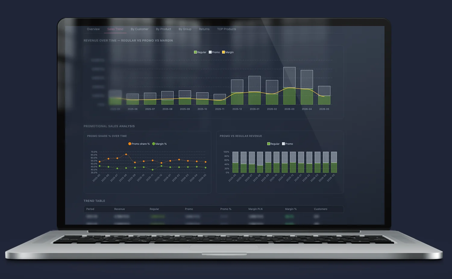
Revenue decomposition (Regular vs. Promo vs. Margin): The system overlays regular sales volume, promotional volume, and generated margin value on one chart. This allows immediate assessment of whether a sharp revenue increase (e.g. in seasonal periods) actually translates into real profit or is merely the result of costly marketing campaigns.
Promo Share % Over Time indicator: Continuous monitoring of sales structure. The module allows control of so-called “promotion dependency”. Comparing the percentage share of promotions with percentage margin over time protects the business from margin erosion and captures the moment when price reductions stop stimulating profitable demand.
Structural profitability control (Promo vs. Regular Revenue): A clear 100% view of the relationship between the regular base and promotional sales. This provides an instant overview of business stability and assesses how strong the natural, organic market position of products is without discount support.
Analytical Trend Table: Everything is presented in a clear, precise trend table. It combines hard financial data (Revenue, Margin PLN, Margin %) with operational data (number of unique customers), allowing rapid detection of anomalies and purchasing trends on a monthly basis.
Demand forecast
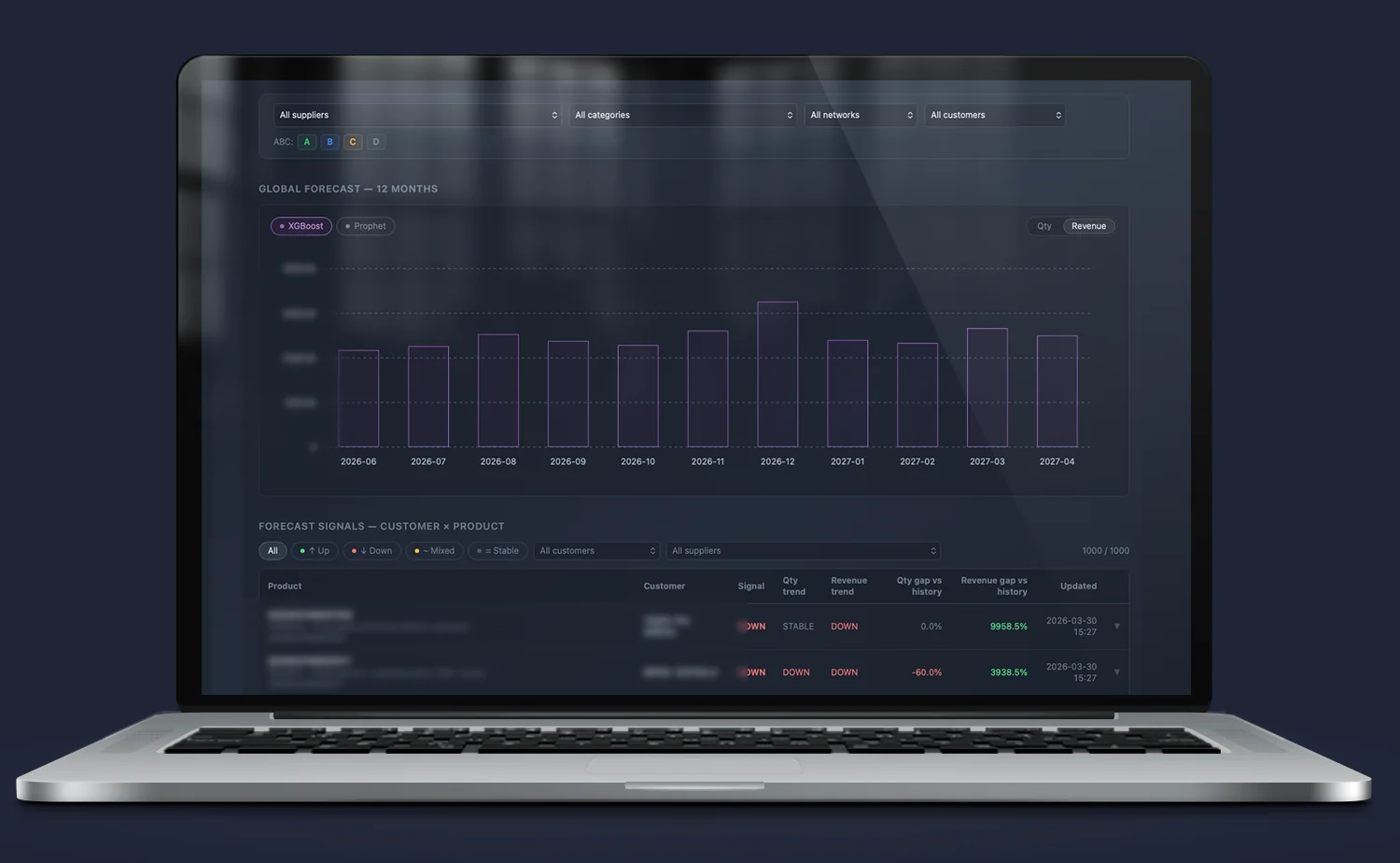
Visualization of ML forecasts generated by Quantis — at SKU level, with confidence intervals. The salesperson or logistician sees not only the forecast, but also how reliable it is for a given product. Forecast for 12 or 24 months ahead.
Additionally, the system generates intelligent signals about future customer behavior. Algorithms analyze purchasing patterns to proactively alert salespeople to the risk of a customer stopping purchases. This allows the team to respond proactively before the customer actually leaves.
Inventory status and rotation
Colorful, intuitive view of the entire assortment — precise information on how much stock is left, how many days it will last, and when it will run out at the current sales rate. Products are automatically marked based on risk level: green (safe stock), yellow (stock running low, time to order), red (critical shortage / out of stock).
Advanced filters allow quick narrowing by supplier, category, warehouse, as well as ABC classification or movement dynamics (Fast, Normal, Slow, Dead).
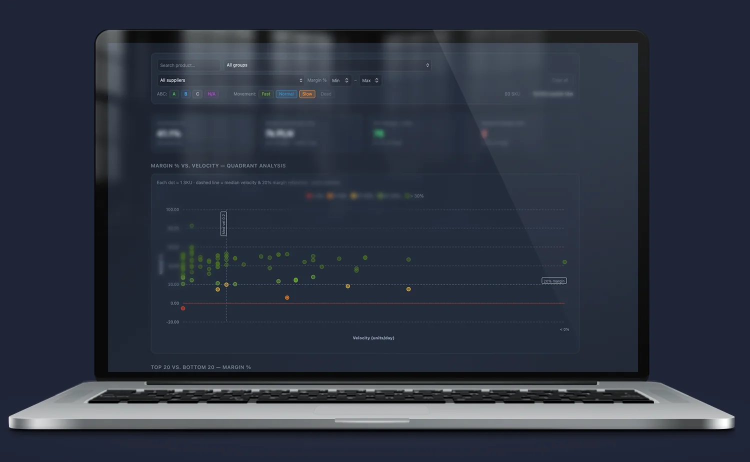
Quadrant analysis (Margin % vs. Velocity): A unique combination of product profitability (margin %) with its rotation speed (units sold per day). Each dot on the chart represents one SKU. It allows immediate identification of “stars” (high margin, fast rotation) and problematic products that tie up capital in the warehouse, generating too low a return.
Key assortment KPIs (KPI Cards): The module aggregates the most important metrics of warehouse financial health in real time: average margin for the filtered group, total margin contribution over the last 12 months, and the number of products meeting profitability criteria (e.g. margin above 30%).
Early warning of losses (Negative Margin SKU): Immediate detection of price anomalies and items that for some reason (e.g. incorrect discount policy or purchase price increase) are sold below cost, generating negative margin.
Extremes comparison (Top 20 vs. Bottom 20): Dynamic rankings of products with the highest and lowest profitability. The tool allows quick identification of the 20 items that build the company’s profit the most, and the 20 positions with the worst parameters that require immediate price review or clearance.
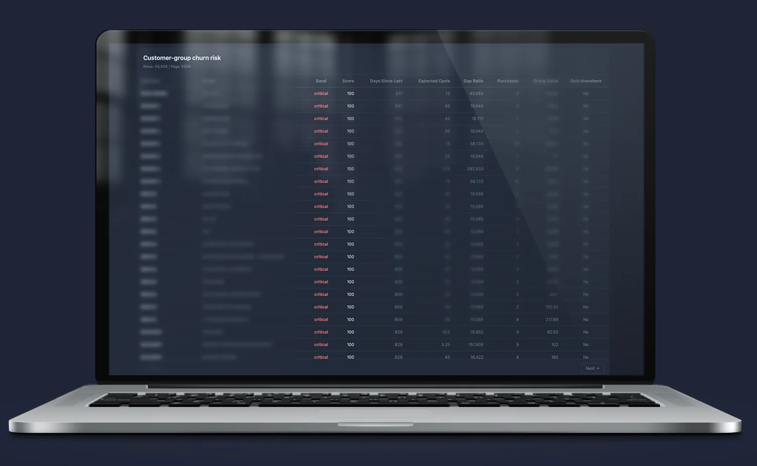
Customer and churn dashboard
Customer portfolio with purchase dynamics. Which customers are growing, which are stagnant, which are starting to drift away. Risk signals visible immediately — without manually reviewing each account’s history.
A unique feature of the module is risk analysis not only for the customer as a whole, but broken down by specific product groups. This allows catching the moment when a contractor starts “taking out” a specific product category from the company.
The mathematical algorithm continuously assesses the health of trade relationships based on a set of precise variables:
Risk segmentation (Band & Score): Each customer-group relationship receives a dynamic risk score (0–100) and automatic priority classification (e.g. critical). This gives sales teams a ready, sorted list of partners requiring immediate contact (actionable insights).
Mathematical cycle analysis (Days Since Last vs. Expected Cycle): The system learns the natural purchasing rhythm of each customer for a given product group. By comparing days since the last order with the mathematically calculated expected repurchase cycle, the module accurately identifies delays.
Deviation indicator (Gap Ratio): A key metric showing the scale of the anomaly. It expresses how much the current purchasing gap differs from the customer’s standard behavior. The higher the ratio, the lower the probability that the lack of order is coincidental.
Value at risk valuation (Purchases & Group Value): The module compares purchase volume history with the real financial value of a given product group for the customer. This allows managers to immediately estimate how much turnover is actually at risk and where commercial intervention will bring the highest return.
Loyalty monitoring (Sold Elsewhere): The system includes advanced flags to verify whether a given product was purchased by the customer through another channel or whether the loss of turnover is a complete demand fade for that assortment.
Promotion and margin analysis
Results of every promotional campaign — real sales growth (Lift%), impact on margin, cannibalization of other products. A view that answers the question: was this promotion worth it — and why or why not.
Promotion econometrics and price elasticity (Promotion & Price Elasticity Analysis)
Moving from intuitive discount planning to precise modeling of consumer behavior. The module analyzes how individual items respond to price changes and which promotional actions actually build additional sales volume (lift), and which only generate margin loss and artificial product cannibalization.
Advanced charts and econometric indicators enable full optimization of pricing strategy:
Lift Distribution: Distribution of products by promotion effectiveness. The system automatically categorizes the assortment: from items where the promotion severely harmed sales (red) to products with a sharp volume increase (green, growth above 100%+). This allows immediate elimination of discount actions that bring no market effect.
Optimal Discount Range: Unique comparison of average sales growth (Avg Lift %) and cannibalization rate (Avg Cannibal %) within specific discount thresholds. The tool indicates the sweet spot – the optimal discount level (e.g. above 30%) that maximizes volume before cannibalization costs outweigh the gains.
Price Elasticity Distribution: Mathematical representation of the elasticity coefficient (β). The module divides the assortment into elastic products (β < −1, where price reduction causes strong demand growth) and inelastic ones. This avoids the mistake of discounting products that customers would buy anyway in the same quantity regardless of price.
What Iris changes in daily work
The owner stops asking for reports. Data is always available, without asking the IT department or assistant. Company status on demand — at any time, from any device.
The salesperson no longer wastes time on preparation. Before talking to a client — one look at the dashboard. Purchase history, dynamics, open recommendations. The conversation starts with context, not from scratch.
The logistician reacts before the shelf is empty. Alert signals visible in the dashboard before they become a problem. No need to check stock manually — the system itself shows what requires attention.
Controlling has numbers without spreadsheets. Margins, rotations, promotion results — available instantly. No exports, no VLOOKUPs, no waiting for someone to prepare a summary.
FAQ
Does Iris work without Quantis?
No. Iris is the interface for the data that Quantis calculates and stores. Without the central Quantis database and its API — there is no data to display. Iris and Quantis are implemented together as one ecosystem.
Does Iris work on a phone?
Yes. Iris is a responsive application — it works in the browser on a phone, tablet, and computer. It does not require installing a separate mobile app.
Does every employee see the same data?
No. Access to data is controlled by a roles and permissions system. A salesperson sees their own customer portfolio. A manager sees their team’s portfolio. The owner sees the entire company. Permissions are defined at the Quantis API configuration level.
Can the appearance of the dashboards be customized to the company?
Yes — in terms of view layout, selected indicators, and color scheme. Iris is built for a specific company, it is not a SaaS template. The scope of customization is determined during implementation.
Does Iris replace Excel reports?
For most daily needs — yes. For one-off analyses and ad hoc summaries, Excel still makes sense. Iris is not a tool for creating reports — it is a tool for daily monitoring. Reports are generated by a separate module of the ecosystem — Clio.
Does the company need its own programmer to operate Iris?
No. Iris is delivered and maintained by Origami Effect as part of the Quantis ecosystem. The end user uses the dashboard through a browser — without any technical knowledge. Updates and maintenance are handled by Origami Effect.
What if the company wants to display Quantis data in a tool other than Iris?
The Quantis API is open. If the company uses Power BI, Tableau, Metabase or another BI tool — it can connect directly to the Quantis API. Iris is the reference implementation built by Origami Effect. It is not the only possible visual layer.
Do you need someone who instantly understands the problem — and knows what to do with it?
Most companies have data. What’s missing is the idea of what to do with it — and someone who will actually execute it. Origami Effect provides both.