
How to turn a million records into a story everyone can understand?
User Data Analysis for a Game Exchange Platform – Power BI Dashboards
Implementation: 2016
The created set of Power BI dashboards showcases analytical capabilities based on historical data from a platform enabling the sale and exchange of computer games.
The report was built on over half a million records, aggregated and transformed using Power Pivot and DAX formulas.
Key visualizations:
1. User migration process between console generations (PS3 → PS4)
The report shows how, over several years, users transitioned from PlayStation 3 to PlayStation 4, analyzing the activity of listing games and the number of titles owned by generation.
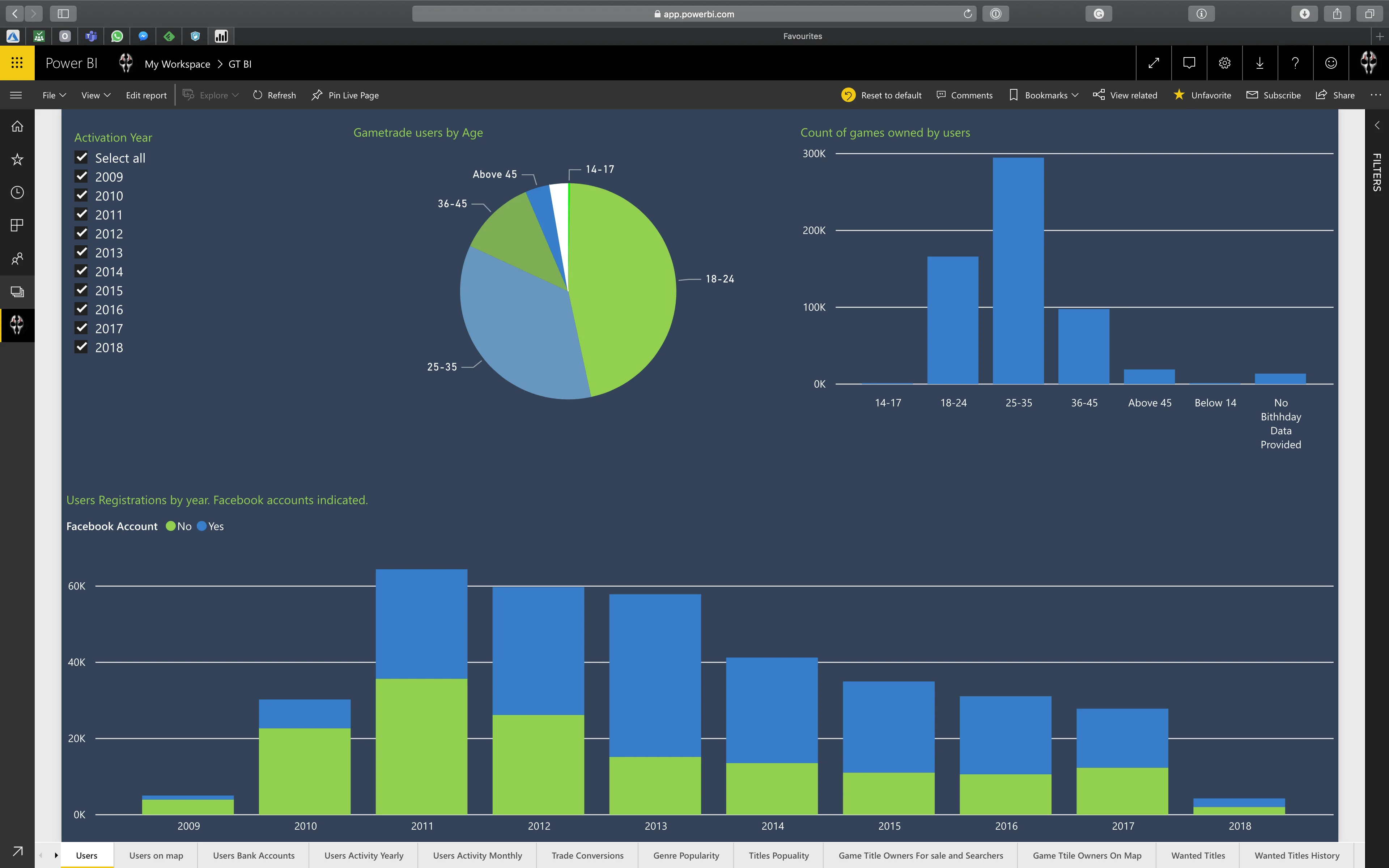
2. User age vs. number of owned games
Age segmentation was used to show which demographic groups were most active in terms of the number of games assigned to their accounts. Column and pie charts enable analysis of the gaming community structure.
3. Account registrations over the years
The dashboard shows the number of registrations in individual years, including user age and links to Facebook and PSN accounts. This is a valuable source of data for evaluating marketing campaign effectiveness and changes in consumer behavior.
4. Offer activity visualization over time
Thanks to dynamic charts, it is possible to track how the number of sent offers (sales/exchanges) changed on a monthly and seasonal basis. The report also analyzes offer effectiveness – how many resulted in a completed transaction.
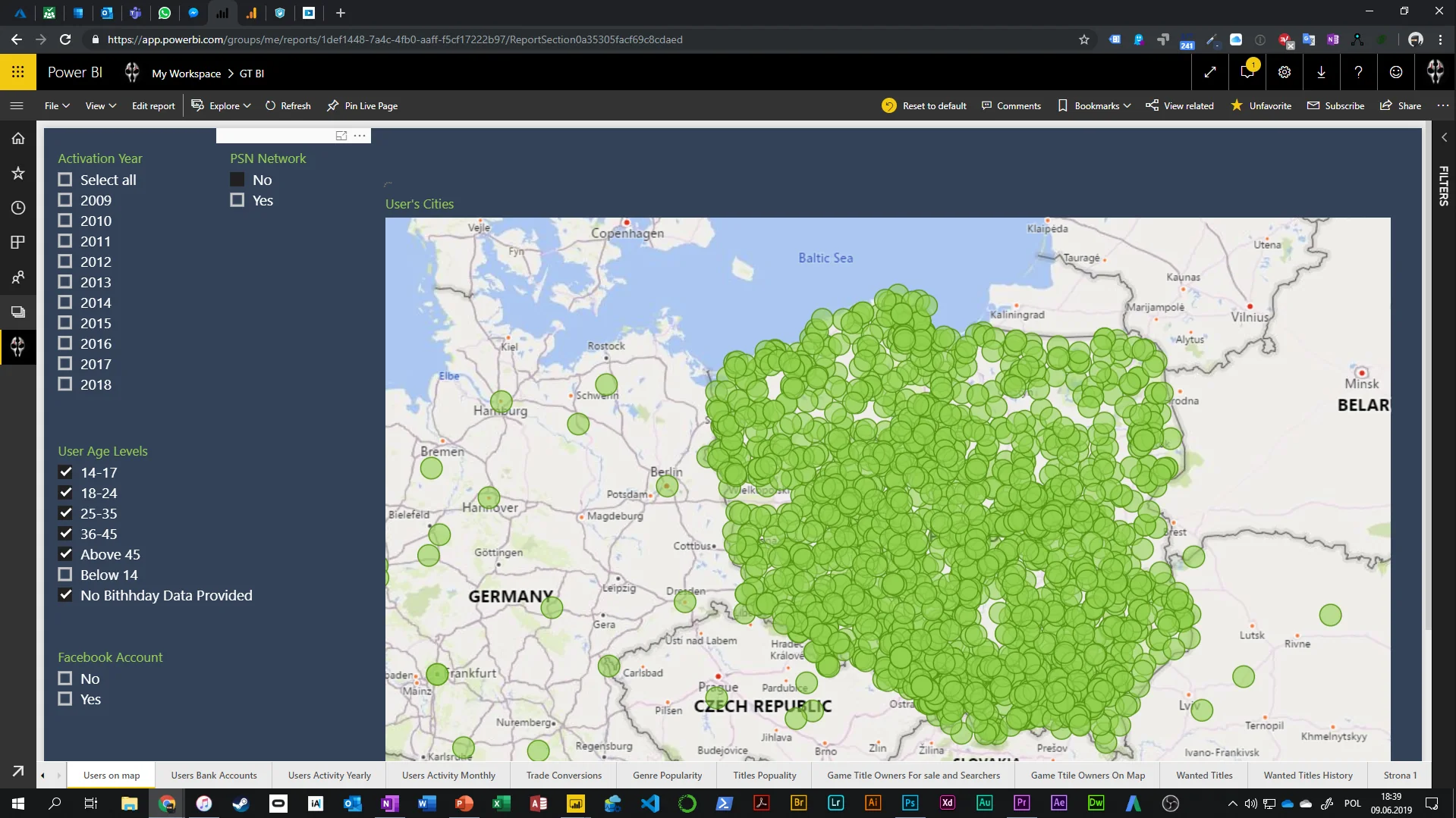
5. User and transaction geolocation
Map visualizations enable user segmentation by:
- location,
- age,
- Facebook account presence,
- registration year.
A separate view also shows the geolocation of owners of specific game titles (e.g., the Assassin’s Creed series), allowing analysis of brand interest at the regional level.
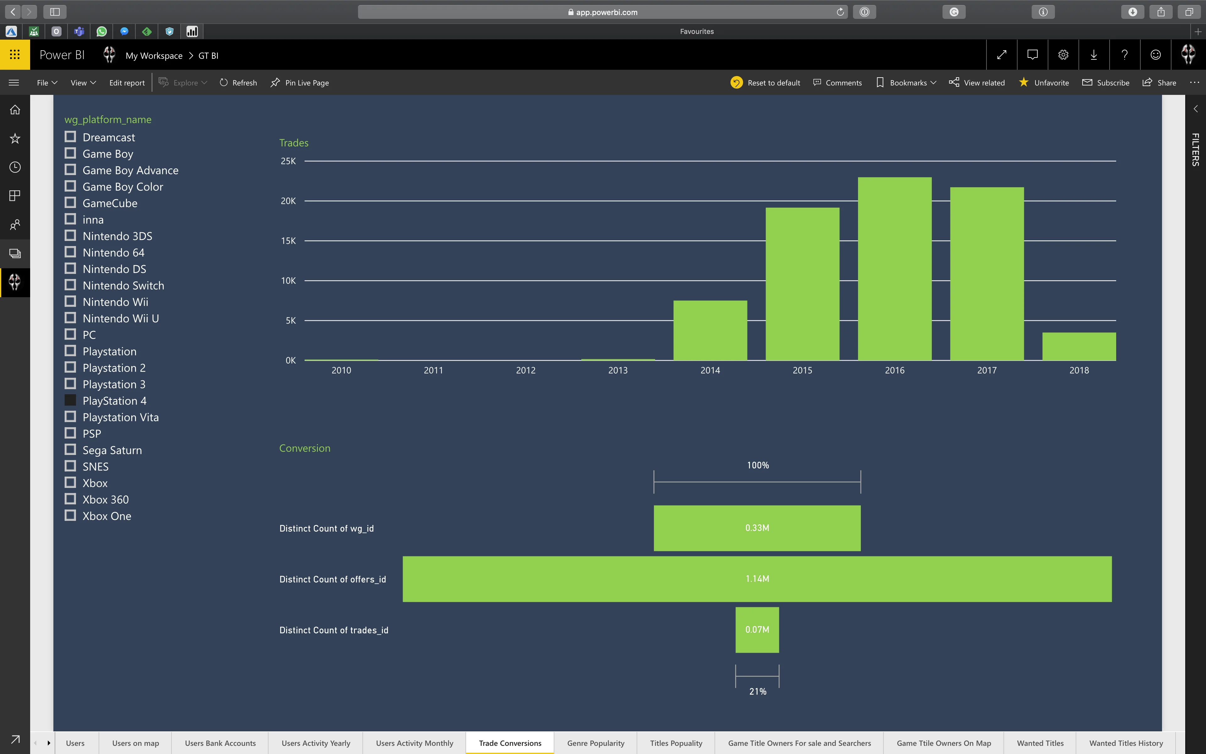
6. Effectiveness of actions and offer conversion
On a separate screen, metrics related to conversion are presented – what percentage of listed offers resulted in a completed exchange or sale. This allows evaluation of user activity effectiveness by platform and time.
Power BI reports summarizing users by age and number of games owned.
Power BI Dashboard
Interactive visualization of user registrations broken down by age, registration year, and account activity.
The presented report shows not only the age structure of the community, but also:
- number of owned games by age group,
- account links to external services (e.g., Facebook),
- registration trends over the years, broken down by age segments.
The applied visualizations (column and pie charts) allow quick identification of the most active user groups and understanding of how age influenced engagement with the platform. This is an example of effective use of Power BI to build a tool supporting business decisions and product strategy.
This report presents an analysis of user offer activity on a monthly basis – both in terms of the number of games listed for exchange and offers placed on games from other users.
By comparing two indicators on a common timeline, you can:
- identify seasons of highest transactional activity,
- spot differences between supply and demand in specific periods,
- better understand the rhythm of the platform and its community behavior.
The visualization allows filtering by platforms (e.g., PS3, PS4, Xbox) and years, enabling detailed analysis of player preferences over time.
Interactive map showing where players who own specific games are located.
This simple yet extremely useful visualization allows identification of the distribution of owners of selected titles, such as the Assassin’s Creed series, on the map of Poland.
Thanks to filters, you can:
- select a specific game from the list and instantly see its geographic reach,
- analyze the regional potential of a title’s popularity,
- identify concentrations of active users, which can serve as a basis for targeting offers, promotional campaigns, or local tests.
This is an excellent example of using Power BI for spatial analysis – not only visual, but also strategic.
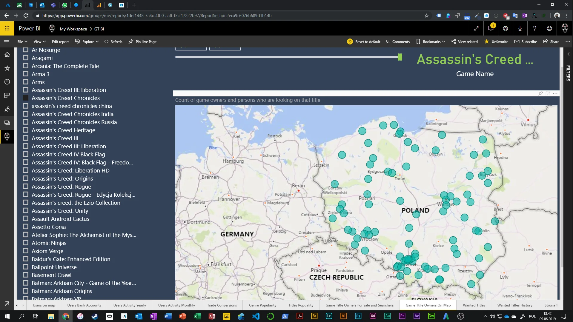
User geolocation map of the platform.
Visualization of user distribution with the ability to filter by age, registration year, and Facebook account presence.
The interactive map shows the full reach of users of the game exchange platform – with accuracy down to locations in Poland and neighboring countries. Thanks to filter layers, quick segmentation of users by the following is possible:
- registration year (e.g., 2013–2018),
- age range (from 0–14 to 45+),
- Facebook account linkage (YES/NO).
The map enables analysis of active account density and identification of regions with the greatest usage or marketing potential. It is an effective tool supporting business decisions, promotional planning, and local product campaigns.
Analysis of offer effectiveness by gaming platform
How many listed offers actually result in an exchange or sale?
This Power BI report focuses on transactional effectiveness analysis – showing how often users finalize their offers depending on the platform (e.g., PlayStation, Xbox, Nintendo).
Thanks to the use of:
- a bar chart showing the number of transactions over time (years),
- and conversion metrics shown as a percentage success rate,
you can easily identify:
- when user activity was highest,
- how effective offers were in different years,
- which platforms stood out with the highest effectiveness.
Such data is extremely useful for assessing the maturity of the secondary market, segmenting active users, and optimizing sales strategy. This is an example of using Power BI not only as a reporting tool, but also as a system supporting business decision-making.
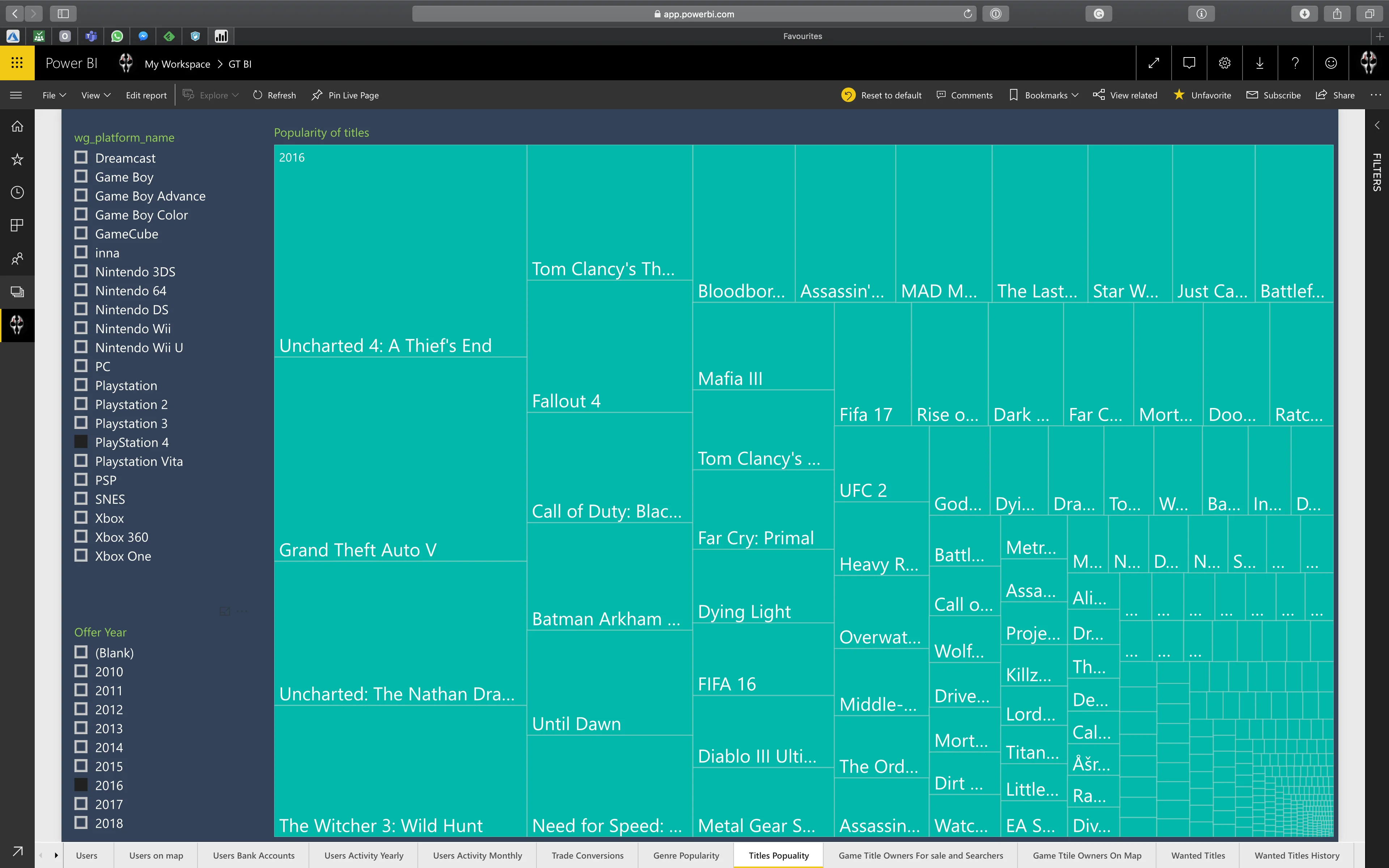
Most popular game titles by platform and year
Overview of the most desired games broken down by year and console systems.
This visualization shows the popularity of specific games on an annual and platform basis (e.g., PlayStation, Xbox, Nintendo).
A TreeMap diagram was used, allowing quick identification of dominant titles in a given period – both in terms of number of listings and share in the secondary market.
The user can:
- select the year and platform of interest,
- check which games were most frequently listed or sought at that time,
- compare interest distribution between competing series and publishers.
This analysis helps better understand consumer trends and identify peak popularity moments for specific titles. It is also an excellent tool supporting purchasing decisions, advertising campaign planning, or secondary market distribution.
Do you need someone who instantly understands the problem — and knows exactly what to do with it?
Most companies have data. What’s missing is the idea of what to do with it — and someone who will actually execute it. Origami Effect delivers both.