
How to monitor Google Analytics data in Excel in real time?
Excel Dashboard integrated with Google Analytics API (GA4)
Project goal:
For over 10 years, reports based on Google Analytics data have been created – for marketing departments, agencies, management boards, and investors. For years, the same problem has been observed:
data from Google Analytics is available, but is rarely actually used.
Companies had access to detailed information about user behavior, but:
- exports were manual and time-consuming,
- data had to be cleaned up in Excel,
- many people in the company didn’t know how to use the GA interface,
- reports were too general or too complicated to support quick decisions.
That is why a set of automated dashboards was created that pull data directly from the Google Analytics API and present it in a clear, practical way — ready for analysis and action.
Moreover, such dashboards were also used in due diligence processes and capital transactions.
This approach was used to verify real website traffic, user engagement levels, quality of acquired traffic, and demographic segmentation – all to:
- assess the quality of the sales funnel,
- confirm the numbers declared by companies being considered for investment,
- conduct an independent analysis of the effectiveness of marketing and retention activities.
This approach allowed investors and funds to much better assess the online value and potential of the entities under review – without having to rely solely on declarations or sales presentations.
Scope of work
- Integration with Google Analytics API
- Fetching data on:
• number of sessions,
• session duration,
• bounce rate,
• countries, cities and devices
• Segmentation by: age, gender, location, device type and day of the week - Creation of an interactive Excel dashboard using Power Pivot and Power Query
- Adding filters and conditional formatting to quickly identify patterns and anomalies
- Ability to combine with data from CRM, campaigns or e-commerce
Result
- One report instead of many sources – available in Excel, ready for filtering, export or presentation.
- Reduction of report preparation time from several hours to a few seconds.
- Better marketing decisions thanks to visible trends and anomalies.
- Greater transparency for management and the ability to react in real time.
Time on page segmentation by age, gender and region
This view shows the average time spent on the site broken down by age groups and gender, with the ability to filter results by regions and months. The dashboard was built in Excel using data pulled directly from the Google Analytics API.
- On the left – a stacked area chart showing changes in average time on page on a monthly basis.
- On the right – a detailed pivot table showing data broken down by age groups and months.
- At the bottom – filters allowing segmentation by gender, age and geographic region.
Thanks to this analysis, the user can easily:
- compare user engagement across different demographic groups,
- catch drops and increases in user attention over time,
- make decisions about content and UX based on real data.
User location and demographics – in one view
This dashboard combines geographic and demographic data from Google Analytics, presenting them in a clear and interactive form. The goal was to minimize the time needed for manual report preparation and increase the time spent on actual data analysis.
- The upper part of the report contains filterable data by age, gender, city and region.
- On the left – a bar chart shows the number of sessions over time, broken down by age groups.
- On the right – an interactive map with demographic data, enabling analysis of user activity in specific locations.
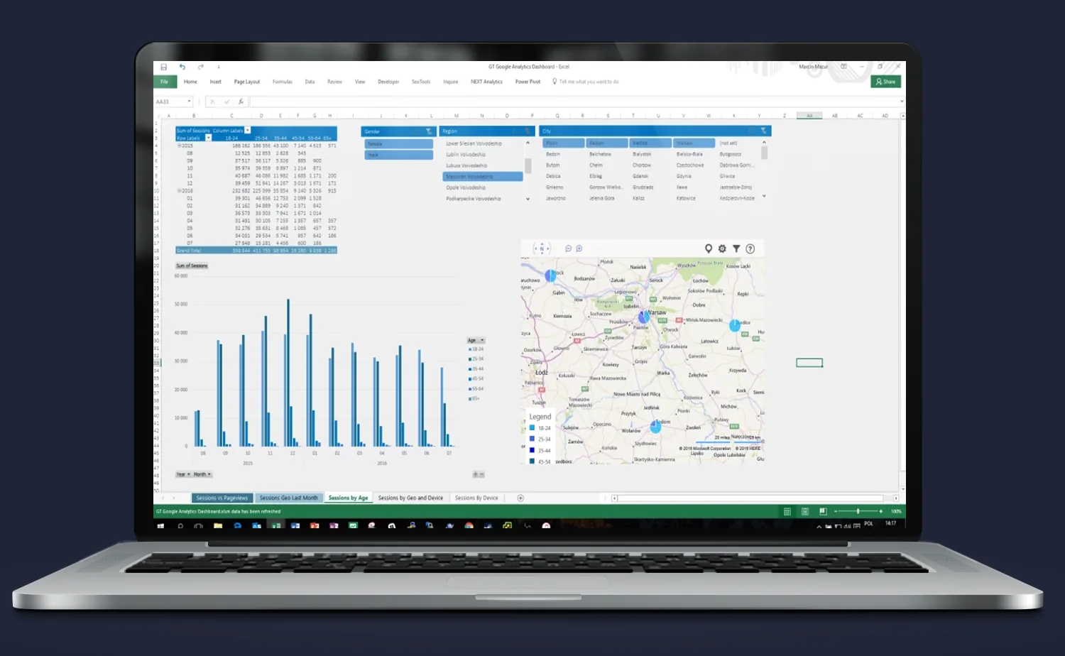
Thanks to this view:
- the marketing team can instantly identify where and who generates the most traffic,
- management receives ready material for decision-making without having to dig through GA,
- the entire report updates automatically – without tedious spreadsheet work.
Result? Less time on reporting, more on analysis.
User engagement by hour and day of the week
This view enables quick analysis of user behavior on the site broken down by day of the week and hour. It is an ideal tool for optimizing campaigns, UX, and content publication schedules.
- On the left – a table showing the number of sessions on an hourly and weekly basis.
- On the right – a bounce rate heatmap that helps quickly identify “weak points” – moments when users disengage.
- At the bottom – dynamic filters allow narrowing the data to a specific country, device type, traffic category and day.
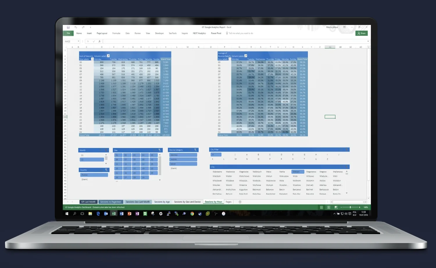
Why does it work?
- It allows discovering when users are most engaged and when they only visit briefly.
- It enables adjusting advertising campaigns or content publication to real hours of activity.
- Conditional formatting makes data interpretation easier without the need for advanced analysis.
Result? Less guessing, more data. And even faster.
Average time on page – demographics and location
This view enables detailed analysis of average time spent on the site by users, broken down by age groups, gender, and region. Thanks to the stacked visualization and dynamic filters, you can quickly identify which user group engages the most and which the least.
- On the left – a stacked area chart illustrating changes in average time on page on a monthly basis.
- On the right – a pivot table showing exact average time on page values by age groups and months.
- At the bottom – segmentation by gender, age and region.
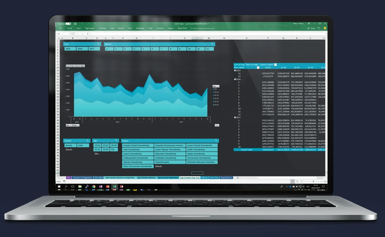
Practical application:
- Ability to compare user behavior from different provinces and demographics.
- Quick identification of which groups are worth serving better or acquiring more actively.
- Allows adjustment of campaigns and content to the most engaged segments.
Result? Fewer assumptions, more real data on engagement.
Session and pageview trend analysis – over the years
This is a cross-sectional view that shows trends in the number of sessions and pageviews broken down by years and months. The report gives an instant overview of the site’s condition and the effects of promotional activities over a long time horizon.
- The main part of the dashboard presents a bar chart (number of sessions) and a line chart (number of pageviews), synchronized on the timeline.
- At the bottom – dynamic filters allow analysis of data by year, month, country and device category (desktop, mobile, tablet).
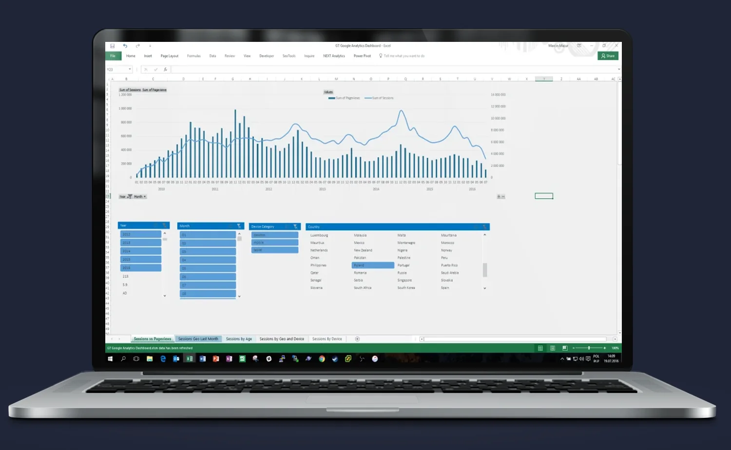
Practical application:
- Identification of traffic spikes/drops (e.g. campaigns, redesign, technical errors)
- Comparison of user activity between years and seasons
- Quick segmentation by countries and devices – e.g. desktop vs mobile in a given year
Result? Management can track trends, measure the effectiveness of activities and make decisions without delays.
Do you need someone who instantly understands the problem — and knows what to do with it?
Most companies have data. What’s missing is the idea of what to do with it — and someone who will actually execute it. Origami Effect provides both.